Thursday, February 28, 2013

Double Baby Cards

Today I have two cards to share with you!  They are the same basic card only one uses a stamped image and the other uses a paper pieced image.  I know that not everyone is into stamps or has a die cutting machine so I hope that one or both of these cards fits into your style!

I am not a stamp coloring person normally but I had to use this Noah's Ark stamp for a relative who is having twin girls!  I love the symbolism of the two animals and how she is bringing two new little ones into this world.  I colored my image using watercolor pencils and a water brush. 
I am no expert at watercolor pencils or shading and blending but I gave it my best.  I started with the ark and added a line of color in each section and blended from there.  I kept adding colors until I was happy with my image.  I need to invest in some watercolor paper for next time because the paper can get pretty wet depending on how much blending you are doing.  
And here is my final result!  I think it turned out pretty good for one of my first attempts at watercolor blending.  One of the biggest challenges was only having 12 colors to use.  I was able to mix colors to get a darker brown for the bears and used more or less pressure on other colors to get different shades.  Now I know why there are so many Copic markers out there!
Here is a closeup of my colored image. I love the embossed pink background!  I only embossed the top portion of the pink paper so that I could stamp my sentiment on the bottom.  This also made it easier to attach the scalloped heart border and twine!
And here is the same card using an image cut from my Cricut!  All I did to change the card was replace the stamped image with this adorable owl. 
The polka dot patterned paper was a little too bold so I used some Tim Holtz Distress Ink to soften the color.  It worked perfectly!  I just love those lashes!  How fun!  A little Distress Ink around the edge of the white paper gives just a little definition. 
I hope you enjoyed seeing a little pink on the blog today!  Thanks for stopping and see you tomorrow for Photo Friday!

Supplies:
  • cardstock: misc
  • patterned paper: Die Cuts with a View (Nana's Nursery)
  • stamp: Art Impressions, My Sentiments Exactly (Baby Sentiments)
  • ink: Memories dye inkpad (black), Tim Holtz Distress (Spun Sugar, Vintage Photo), Close to My Heart (Cocoa)
  • Circut cartridge: Create a Critter
  • embossing folder: Cuttlebug (Polka Dots)
  • tools: American Crafts (Knock Outs punch-Scallop Heart), aqua brush
  • watercolor pencils: Faber-Castell
  • misc: pop dots, Xyron, Doodlebug Design (Doodle Twine-Baby Girl Assortment)

Tuesday, February 26, 2013

Sporty Birthday Card


One of my boys had a birthday party to go to over the weekend so I needed to make a quick card for him to take to the party.  Even though I have four boys, I still find it hard to create boy/masculine cards!  I think one of the reasons for this is that so many cards you see are very feminine.  Flowers, glitter, lace, and all things feminine show up on cards everywhere.  I want to show you that with a little adjustment in color, shape, and style you can turn any card into a great card for the special boy/man in your life! 

I got the inspiration for my card from this card.  The color combination used in my inspiration card are really great colors and are also gender neutral.  By using a more subdued color combination of blues, greens, yellows, and browns I made a more masculine looking card.  I think that changing your color combination has the most impact in changing the feel of your card.   

I loved the two different patterned papers set apart by the border on my inspiration card, but a frilly border just didn't work for my sporty card.  The Zig Zag border punch by American Crafts was exactly what I needed!  You could also use a torn edge or even a notebook edge if you wanted.  You still get the separation with a border without it being frilly.  I also changed the shapes of the three stamped images from scalloped circles to squares.  I feel like the squares are a little more 'boyish'.  Circles would also work great.  This change in shape really changes the feel of your card.  A little white gel pen adds a little something extra and helps define both the border and the sentiment. 

Finally, and perhaps the easiest change, is to change the images to fit the style of card you are making!  Adding different balls to my card was really simple using my Cricut and really adds that masculine touch.  Stars, trucks, trains, frogs, etc. are all great 'boy' images to add to your cards.  To get a little bit of a textured look on my basketball and football I set the brown paper on my Versamark stamp pad and pushed it into the ink just a little.  This makes some darker 'spots' on the balls that give them a little something extra.

I hope the next time you need to make a boy/masculine card you can create a fun card just by changing the color, shape, and style of another card that you love!  Thanks for stopping!


Supplies:
  • cardstock: Close to My Hear, misc scraps
  • patterned paper: Close to My Heart (Good Times)
  • ink: Versamark (Watermark), Tim Holtz Distress (Walnut Stain)
  • embossing powder: Ranger (Superfine Clear)
  • stamp: Stampin' Up
  • Cricut cartridge: Boys Will Be Boys
  • pen: Uniball (Signo Broad White)
  • tools: American Crafts (Knock Outs punch-Zig Zag)
  • misc: popdots

Friday, February 22, 2013

Photo Friday- Winter Storm Q

Snow is here in the Midwest!  Winter Storm Q dropped about 8" of snow in our area.  Today's Photo Friday is all about watching the snow 'grow' in your photos and documenting change.  I took a photo at 10 am and one every hour after (once the snow started falling) so that I could see how the snow accumulated.    I just love seeing how much it changed every hour. 


When I scrapbook these photos I plan to put them in a flip book of sorts so that we can flip the pages and really watch the snow 'grow'.  You could do this same thing for other photos as well.  Pregnancy, a little girl or boy growing out their hair, a wound healing, and building a puzzle all could be the subject of your photos for this technique.  Just make sure to frame your shot as close to the same as possible to really make the change apparent.  You might have to take a photo every hour like I did or once a week or even once a month.  It all just depends on what change is occurring.

I hope this gets you thinking about what kind of changes you can photograph.  Drive safe, stay warm, and most important keep making memories.  Thanks for stopping! 

One more random photo that has nothing to do with snow or change.  This one is for you dad.  :)

Thursday, February 21, 2013

Ombre Thank-You Card

Today's card is a fun thank-you card using embossing and pigment ink to create an ombre effect.  Ombre is a coloring technique that has varying shades of the same color (think of a paint color swatch).  This technique works great as a background on a card!  I just happened to purchase some pigment ink that has varying shades of the same color and wanted to give this technique a try.

I started inking my background stamp at the top with the lightest shade of ink horizontally and kept inking rows of color a shade darker until I reached the bottom of the stamp.  I think I used four ink colors in all.  Then I covered the whole stamped image with clear embossing powder and embossed.  Because I was using pigment ink it stayed wet while I was inking the stamp with all of the different colors of ink.  I also inked around the edges of my stamped paper when I was done and added embossing powder to the edge of my paper and embossed again.  This gives the stamped image a really cool, defined edge.
 
I used a corner punch a friend had given me and used it to bring attention to my sentiment.  I also embossed both the sentiment and the edges of the paper.  Adding some gems really brings attention to this part of the card.  A banner with some white gel pen dashed lines really finishes the card off. 

I hope you enjoyed this simple card today.  Ombre is a great way to make a simple but striking statement.  Try vertical or diagonal lines of varying color for a different effect.  I hope you'll give it a try on your next card or layout.  Thanks for stopping!

Supplies:
  • cardstock: misc scraps
  • patterned paper: Die Cuts with a View (Everyday 6x6 Stack)
  • ink: Inkadinkado (pigment ink stack Cool Pastels)
  • embossing powder: Ranger (Superfine Clear)
  • stamp: ScrapAce (sentiment), Hampton Art Stamps (Thank you pattern)
  • tools: EK Success (corner punch)
  • pen: Uniball (Signo Broad White)
  • misc: pop dots, Imaginisce (i-rock gems)

Tuesday, February 19, 2013

Use Distress Inks to...

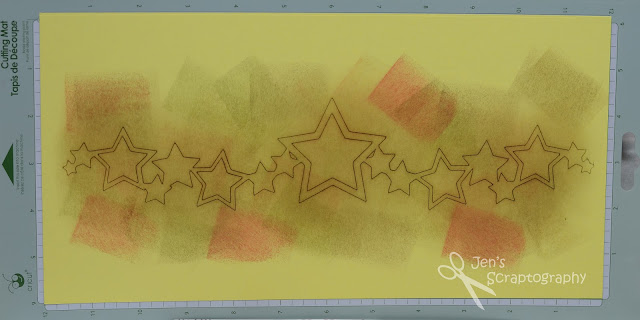
alter your paper color!  Have you ever been working on a layout and not had the right shade of cardstock?  I know that I have numerous times.  One of three things happens when this occurs: 1) I go to the store and buy the paper that I need, 2) I make due with what I have even if it doesn't match perfectly, or 3) I change my whole layout to fit with a different shade of paper.  None of these options are bad but there is another choice.  You can alter a paper color with Distress Inks!  That is exactly what I did with the star border on this layout.

I really wanted a golden yellow color and had nothing like it at all.  So I grabbed a sheet of yellow cardstock, used my Cricut to cut out the border, left the cut image on the cutting mat, and started inking!  I started with Frayed Burlap and then added small bits of the other three colors until I got the color I was looking for.  You can really see the difference in the color to the part that isn't inked.  What a change!  After I was all done inking I then sprayed Bronze Glimmer Mist over this to give the whole border a bit of shimmer.      


Here is my completed layout.  I was following this sketch as a source of inspiration.  I just love how the border turned out!  I used the cut out stars on other parts of my page to help tie it all together.  Why make other embellishments when I already had these cut out!


 Here is a close up of the left page.  I also used Distress Ink to color the vellum for my journaling. 

 
Here is the right page.  The twine really makes a fun border between all of the pictures.   


To really make my border shine I added glitter on scrap paper behind a few stars and gems on others. 


My title was cut on my Cricut.  I just love how I can create any title and cut it out of paper that matches exactly what I want! 


 And one more of my border.  I just love it!  Pop dots also help to give this border a little more flare.
 

There you have it.  You can alter your paper color with Distress Inks!  I hope that the next time you find yourself looking for a shade of cardstock and you don't have it that you reach for your Distress Inks and alter some cardstock you already have.  I think you will be pleasantly surprised at what you can come up with.  Thanks for stopping!

Supplies:
  •  patterned paper: Carolee's Creations (Ho, Ho, Ho and Burnt Red)
  • cardstock: misc
  • Cricut cartridge: Christmas
  • ink: Tim Holtz Distress Ink (Frayed Burlap, Walnut Stain, Forest Moss, Fired Brick)
  • bling: Imaginisce (Hot Rocks Compact- Jewel), Mark Richards Glittler Domes (white)
  • misc: Doodlebug Designs (Doodle Twine Christmas Assortment), pop dots, Scotch (vellum adhesive, Quick Dry adhesive), vellum, Recollections glitter (Snow), Glimmer Mist (Bronze)

Saturday, February 16, 2013

Add Some Sparkle

What a week!  Looking back I think I was a little over ambitious to post three layouts this week but it is done.  So here is your last one for this week.  Once again I have two similar layouts for you.  One for Zach's book and one for Alex's.  It just happened that the challenge over at Playing in Paradise #104  is Add a Little Sparkle!  Keep reading to see how I added mine.    

I almost always create layouts with 4x6 pictures or smaller.  Rarely will I use a 5x7.  This layout is an exception.  This photo is one that I had given my grandmother and when she passed away a few years ago I got the photo back.  I finally am getting it in an album!  It was different working with a larger picture but I love how this turned out.  Banners are really popular now and I wanted to try some on this layout with some patterned paper.  I free hand cut the banner ends and inked the edges for a more unified look.  I also got out my Sew Easy tool and some embroidery floss and added a little stitching detail.  Adding gems on the ends of the stitching gives an ending point to the stitching and also adds a little bit of sparkle! 
I got these stamps at the Creating Keepsakes Convention in Kansas City last year and boy are they fun!  The set came with a solid version and this version (which happens to be just the right size for i-Rock gems)!
To get this cool gem title I first stamped my letters in green ink (that way if my gems slid a little you wouldn't be able to tell).  Then I used my i-Rock tool to add some gems.  If you don't have a stamp set like this you could easily create this same effect using any stamp by adding gems over your stamped letters.  You could space them out like these are or place them side by side.  Either way is a fun way to add some sparkle to your stamped title! 
Here is Alex's version of this page.  I had some additional pictures of him by himself that I wanted to include so that made my layout slightly different.  I kept the three patterned paper banners but put them closer to the edge to make room for my larger photo block. 
I felt the stitching wasn't needed on this layout but I still used the embroidery floss by wrapping it around my journaling block.  This helps to add a little more green to the layout and a little bit of interest.   

The photo block on this layout gave me a little bit of trouble.  I really didn't like the uneven edge where the vertical and horizontal photos met.  This chipboard heart just happened to be just the right color and size to really tie the photos together.  I 'luv' how it turned out.   
Well, there you have it.  I hope you add some sparkle to your next page!  Thanks for stopping!

Supplies:
  • cardstock: Wausau Paper (Crinkles Cotton, Crinkles Cocoa)
  • patterned paper: ? (I don't have the packaging- possibly We R Memory Keepers)
  • stamp: ScrapAce
  • ink: Tim Holtz Distress Ink (Walnut Stain, Peeled Paint)
  • marker: Zig Writer (Chocolate)
  • tools: Imaginisce (i-rock), Creative Memories (corner rounder), Perfect Layers, We R Memory Keepers (Sew Easy Stitch- Straight)
  • misc: Imaginisce (Hot Rocks Compact- Jewel), misc gems, Pebbles (Chips- Spring Green), thread, pop dots

Friday, February 15, 2013

Photo Friday- Little Miss Oakley

Last week while back for my grandmother's funeral I was able to meet my newest niece, Oakley, for the first time.  She is adorable!  I love all of that hair!!  It was so fun to see my brother and his wife taking such good care of their little sweetie.  She was so good and took naps on almost every one's shoulder.  Of course I had to get my camera out a few times and catch those super sweet moments. 

While on our trip we took a side trip to visit my dad's aunt.  She is the sister of my grandma who passed away a few years ago (before I was really into photography).  I really wish that I had taken more photos of her.  This was the next best thing.  I love seeing her hands holding Oakley.  She is 90 years old and I love thinking of what her hands have done and what Oakley still has yet to learn.  So beautiful.  Needless to say Oakley stole her heart too! 


And finally Oakley got a chance to stretch for awhile.  Boy did she love it!!  The boys also enjoyed watching her.  They had a little cold so they weren't able to hold her and they were bummed about that.  They could lay on the floor and watch her though.  They sure enjoyed watching her move and watch them.  What great memories for these cousins. 


I hope you enjoyed these pictures of little miss Oakley.  I'm hoping to get another layout on the blog tomorrow so stay tuned for that.  Thanks for stopping!