Wednesday, March 26, 2014

How to Make an Ink Swatch Ring

A lot of the blogs I like to follow have been sharing how they organize their inks and how they make swatches for them.  There is a kit at Simon Says Stamp for this exact purpose.  It is a super cute way to organize your ink colors to make it easy to pick out colors for projects.  I would LOVE to have this little swatch kit but I knew that I could make my own version with supplies I already had on hand.  Let me show you what I came up with!

Aren't these fun?!  All of these tags are on one ring and I can easily fan through it to pick the inks I want to use on my projects.  This is so much easier than going through all of my ink pads.  Also, sometimes the colors on the ink pads aren't actually what you get when you use them.  Plus, this just looks so pretty!  Let me tell you how I made these and why I have two different types of tags.  

I used some plain white cardstock cut to 2" x 4" and punched a hole with my Crop-A-Dile- in the center.  Now I'm ready for stamping.  The first tags I'm going to show you are for my Close to My Heart and Momento inks.  These inks I use for stamping detail stamps and images.  I first used the back side of a border stamp to stamp the solid image.  Because it is the back of a stamp the top and bottom edges aren't very defined.  I'm OK with that.  You could use the back of any rectangular stamp to get this solid image.  Next, I used a fun chevron stamp to see how the ink works with a background type stamp.  Finally, I stamped a cute ticket to show the detail when stamping with this type of ink.  I then wrote the brand and color on the bottom with a marker.  Super easy and a great way to organize. 
Now let me get to my favorite inks.  Tim Holtz Distress Ink.  If you follow my blog you know that I use this ink on almost every project.  I love this ink!  I use this ink in different ways though so I couldn't make the tags the same.  I wanted to make sure that these tags reflected how I use this ink so here's what I did for these.  

I started with the same tag but used more distress looking stamps.  No clean edges here.  That's not how I use these stamps.  I started with a solid stamp again, this time a paint stroke.  I wanted to get the natural color of the ink.  I then stamped the same image again only this time I covered it with clear embossing powder.  Distress Inks stay wet longer so I often use them with clear embossing powder.  This makes a more intense version of the color.  I love that even though it's the same color you get a different look.  Although I do use my Distress Inks for stamping I mainly use them with my ink blending tool to blend color on paper or over another stamped image.  I grabbed another distress stamp, inked it with VersaMark, covered it with clear embossing powder, heat set it, and then blended the ink over the top.  The Distress Ink will wipe off the embossed area leaving the design in amidst all that gorgeous blended color!  I did use a piece of masking paper to mask off the top part of the card before I started blending. 
One thing I found helpful to do when making these Distress tags was to make them in color families.  I grabbed five colors from one family and did all the solid color stamping first.  I them stamped the bottom of the card with the VersaMark and then finally the solid stamp to be covered with embossing powder.  That way I could apply embossing powder to both areas at once.  I could then heat set all the cards and then apply the blended ink.  Working in color families from lightest to darkest meant I didn't have to worry too much about contaminating colors and it saved a lot of time.  Yes, I have a blending tool for each of my ink colors.  I love it!  A big thanks to my dad who made them for me.   
I just love how pretty these all are lined up together!  Lovely!!
Once all your tags are done and on a ring it is super easy to look through the colors to match to your project and each other.  I will often pick out my colors and leave my ring open out on my table while I work.  Here are a couple of combinations that I used recently on projects.  

I love how I can see what the colors will look like together before I even start my project.  If you don't have an ink swatch ring I would highly recommend making one.  Mine hangs right next to my work space and is there whenever I need to choose ink colors.  No need to run around my room collecting inks and then finding out they don't look right together.  Perfect matches every time thanks to this little ring.  I hope you've been inspired to make your own swatch book.  If you do let me know.  I'd love to see how you created yours.  Thanks for stopping!

Supplies:
  • ink- Momento Dew Drop, Close to My Heart, Tim Holtz Distress Ink, VersaMark (Water Mark)
  • stamps- Lawn Fawn (Chevron Backdrops), My Minds Eye (Dilly Dally 'Adventures'),Bo Bunny (Geometric Patterns), Hero Arts (Brush Strokes)
  • embossing powder- Ranger (Super Fine Clear)
  • pen- American Crafts (Project Life 05-Black)
  • cardstock- The Paper Studio
  • tools- paper trimmer, Crop-A-Dile II

Thursday, March 20, 2014

Little Layouts

Today I'm sharing a couple of small Project Life pages for you.  I still haven't completely 'made the switch' but I'm loving this style of scrapbooking more and more.  I even recently signed up for the Studio Calico Project Life monthly kit.  I know I'm technically breaking that promise of not spending money on scrapbooking supplies unless I actually 'need' it, but I really love the idea of some new and trendy things arriving right at my front door every month!  Plus, the only way my husband would let me sign up for it was if I promised to work out 4 days a week!  That was on my list too and I must admit I've been failing at it.  This is just the motivation I need.  I'll let you know what I think of it when my first kit arrives next week (and how my workouts are going)! 

Here are today's pages.  I used the Design H Project Life plastic for these layouts.  I love that you can use these in so many different ways!  I would usually think of this as an additional page in the middle of a large spread with many photos but it also works great as a small page in the middle of an album.  Since these pages are in one protector I was able to stretch my supplies.  I matted all the photos with only two pieces of paper (one photo on the front side and one on the back from each layout).  I also only used two Project Life cards!  I love when I can use both sides of a card on different layouts.
To add some interest to the left page I made a border with Distress Inks that matched my photos.  I just stamped the three arrows over and over in the different colors.  I love the fun addition this makes to the page.
I recently picked up a roller stamp at Target for $1.50!  I love that they carry seasonal items in their scrapbooking department.  When the season is over you can snag some great deals!  Valentine's is not my favorite holiday but I'm a sucker for an inexpensive stamp.  This one had this great LOVE with the hearts on either side (among other designs).  I love the simplicity of this stamp and you could easily cover the hearts with brads, flowers, or anything.  I used some Diamond Stickles to add some sparkle.  Also, this Project Life card was the perfect background for this 'Polaroid' photo.  The other side is a journaling card which you'll see in just a bit.   
My photos had some open space so I pulled out some rubons that I really need to use up.  I added a phrase to each photo.  I just love using up supplies!
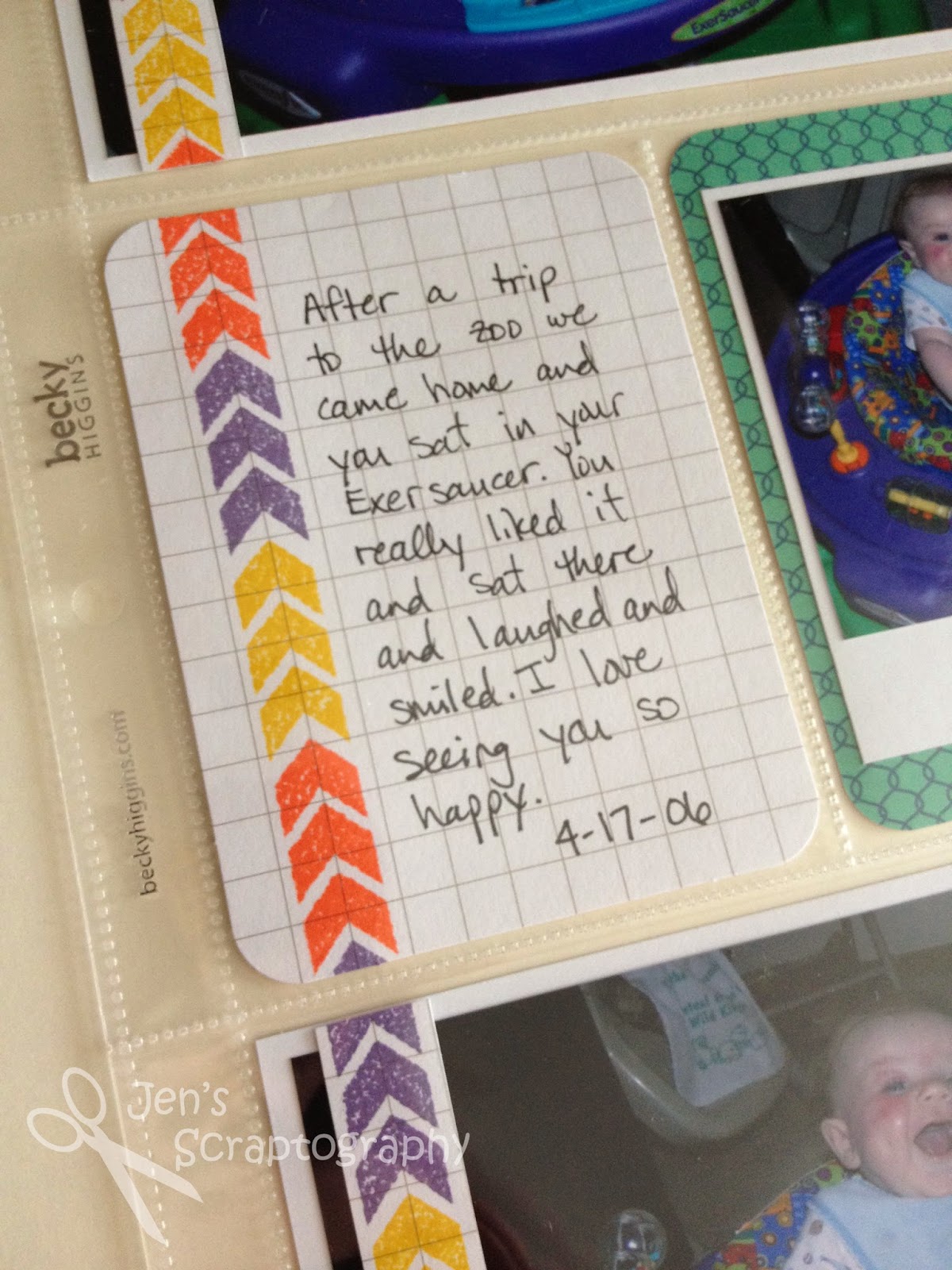
Here's a closer look at my journaling.  (Yes, I really am still scrapbooking 2006.  I'm really hoping to get started on some current layouts with my new monthly Studio Calico kits.  Keep your fingers crossed).  I just love these grid cards.  I think you'll love how I used the back side of this card on the other layout. 
Now onto the backside of this layout.  I already mentioned that I matted the photos with the same paper.  This side was even easier than the other side because I only had the journaling and a filler card.  Here is the backside of the 'Polaroid' card.  It was the perfect place to tell my story.  I just added some small alpha stickers and that's it.  
I had a little fun with the back of the grid card.  I knew that I just wanted a filler type card here so I used a stamp set that I've had for a long time and made my own filler card!  I stamped the train in red ink, covered it with some masking paper, then I stamped the track.  I also stamped the train on a scrap of white paper with black ink and cut out the top of the train and the tires to add some interest to my train.  I used some more masking paper before adding the crossing sign.  I just love how this card turned out!!  Had I been thinking I would have reversed the order of the cards so the train was moving 'into' my layout instead of 'away' from it.  The reason I couldn't do this was because I was using the backs of the other cards and I didn't want to move my borders.  Next time I'll plan ahead a little better. 
Here is a close up of my cute little train.  You could also use stickers or patterned paper to create a filler card that matches your layout.  Have fun with it.   
Two more pages done in the book!  I hope you enjoyed these quick Project Life pages.  Hopefully you'll be seeing more of these types of layouts once my kit arrives.  If you follow me on Facebook I'm sure I'll post about it on there.  Have a great day and thanks for stopping!

Supplies:
  • cardstock- The Paper Studio
  • ink- Tim Holtz Distress (Mustard Seed, Ripe Persimmon, Dusty Concord), Momento (Tuxedo Black, London Fog), Close to My Heart (Holiday Red, Sunny Yellow, Cocoa)
  • stamps- My Mind's Eye (Boy Crazy), American Crafts (Valentine Roller Stamp), Close to My Heart (Choo Choo Train C1221)
  • pen- American Crafts (Project Life pen 03 Black, 05 Black)
  • alpha stickers- BoBunny (Letterific)
  • Project Life- Jade Core Kit, grid cards, Design H plastic
  • misc- rubons, Ranger (Diamond Stickles), masking paper

Friday, March 14, 2014

Guest Designer Challenge PPC #11

Today I'm excited to share the card I made as a guest designer over at the Playing in Paradise Challenge.  They have great challenges and great prizes!  This challenge is no different.  Here it is: Use a black & white, sepia photo or stamp image with a splash of color.    

I'll admit when I first saw this challenge I had no idea what I was going to create.  Then I remembered I had a Tim Holtz stamp that would be perfect for this and my card idea sprang from there.  Here is what I came up with.
 
I loved this image and phrase and thought they would make a great card.  I wanted to have a little fun with the splash of color so I turned to my favorite Tim Holtz Distress Inks.  I wanted the 'rain' to look like colors and the man to be standing in a 'puddle'.  I think it worked!  I smeared a small line of each color of Distress Ink on my craft mat and then gave it a little spritz of water.  I did this a few times on different watercolor papers because if you add too much water the colors will be very pale and I wanted them to be vibrant.  After spritzing the ink with water I placed the bottom half of my watercolor paper in the ink and let it dry.  I really wanted a rainbow effect so I tried not to let the colors blend too much.  Once this was dry I stamped my image and phrase right over the color.  Using the Compact Stamp Press makes it really simple to see exactly where you want to place your image.  I really love how the man is 'standing' in this colorful puddle.  
I then stamped the same images on masking paper and cut around them to cover up my image and puddle.  I tried to create what I thought would be the path the rain would take after falling off an umbrella.  Nothing here has to be perfect.  Just a general shape to keep my stamped area clean.   
Next I found a border stamp that had some movement and reminded me of falling rain.  This stamp is actually from a Christmas set!  I just love when I can use a stamp in a new and unexpected way.  I stamped this in the open area with VersaMark ink varying the placement so that it would look more random.  Once I was done stamping I covered the stamped area with clear embossing powder and heat set it.  I love the shine and movement this adds to the card.  It almost feels like rain is falling! 
I then removed the masks and added some gems in rainbow colors to various areas to mimic colorful raindrops.  This adds a little more color and some dimension.   I also inked around the edges of this watercolor piece with some Black Soot Ink for a little definition. 
Here's another look at that colorful puddle.   Did you know I love rainbows and Distress Inks?  This is just perfect in my book!
So there you have it, a black and white image with a splash of color!  I hope you enjoy this card as much as I do.  I invite you to play along.  I'd love to see what you come up with!  Thanks for stopping!

Supplies:
  • inks- Tim Holtz Distress Ink (Barn Door, Spiced Marmalade, Mustard Seed, Mowed Lawn, Tumbled Glass, Dusty Concord, Black Soot), VersaMark (Watermark)
  • stamps-Tim Holtz (Purely Random), Close to My Heart (Jingle Borders D1225)
  • embossing powder- Ranger (Super Fine Clear)
  • tools- Fiskars (Compact Stamp Press), Imaginisce (i-Rock)
  • misc- Imaginisce (gems), watercolor paper, masking paper

Friday, March 7, 2014

Photo Friday- Life Unedited

I'm finally back with a Photo Friday!  Sorry it's been so long.  Today I'm sharing what we've been up to these past few weeks.  In between cooking, cleaning, and volunteering at school I have managed to capture a few bits of life.  I decided to leave these photos as is (except for the watermark).  You can't always edit life and sometimes I don't want to edit photos.  So here is our life unedited from the last few weeks.  

We've enjoyed some 4th and 5th grade basketball.  I've learned to embrace the poor lighting in the gym.  I've bumped up my ISO and am enjoying some fun shots (no pun intended).  :)   

Someone in our house started wearing glasses.  He really enjoys reading the comics now. 

We enjoyed a musical put on by the 1st and 3rd graders at the school.  The first graders were mighty medieval men.  Here is his mighty pose.   There's nothing better than the backdrop and stage curtain for getting some quick, posed shots after the show. 

The boys had some fun in the snow, both shoveling and having a snowball fight.

We also watched our niece and nephew for five days.  We had fun reading, watching Jake and the Neverland Pirates, and of course taking pictures. 

I hope you have a great weekend.  Thanks for stopping!

One Tired Dude Layout

Sorry it's been awhile again since I've posted.  Life just doesn't seem to slow down.  I created this fun layout and then realized it fit along with the Playing in Paradise Challenge!  The challenge was to use five things from Linda's favorite list.  I used brads, buttons, stickers, diecuts, and eyelets!  Lots of fun stuff to play with so let me show you what I did!
I just adore these pictures of my son asleep.  There is something so precious about them when they are sleeping.  I bought the Swagger collection by Fancy Pants Designs over the summer and this layout just screamed for me to use it.  I love all of the patterns in the collection so rather than just choose one I chose to use a few and made a hexagon border.  I really wanted to go out and buy a set of hexagon nesting dies but in trying to stay with my resolution of using what I have I found a stencil, traced them, and cut them out by hand.  This took a little time but I feel good about not running to the store to get something I didn't really 'need.'  The polka dot pattern isn't from the Swagger collection but is washi tape!  I covered a piece of scrap white cardstock with the washi tape and then cut out the hexagons from it.  I then inked the edges of all the hexagons with some Studio G pigment ink.  I love this grey ink!  It's the perfect grey ink to use with this collection.   
Once I got the hexagon border on my page the rest was simple.  I matted the photos and also inked those edges.  I used a 4x6 card from the collection, cut it, and used it for my title and journaling!  I just love killing two birds with one stone.  I added some letter stickers to one part to finish my title.  
I stamped a journaling spot with a stamp from the Teresa Collins He Said She Said collection on the other part of the card.  It is very subtle with the grey ink but I think it works great for the page.
Clusters of a brad, button, and eyelet add some fun dimension and help create a visual triangle on my page.  I tend to hoard these so I'm really trying to get them out of my stash and onto my pages.  I also added a sticker to add to the feel of the page.   
A little scoring on my Martha Stewart score board with a little sanding in opposite corners adds some texture and finishes off my page.
I hope you enjoyed this fun and easy to put together page.  Thanks for stopping! 


Edited to Add-  So after I posted this post today I came across the Happy for Hexagons Challenge in the Moxie Fab World.  The challenge- use hexagons on your project!  Of course I have to enter this over there too.  I just love hexagons!  Have a great day!

Supplies:
  • cardstock- Core'dinations (Nostalgia)
  • patterned paper- Fancy Pants Designs (Swagger)
  • stamp- Teresa Collins (He Said She Said)
  • ink- Studio G
  • tools- Perfect Layers, We R Memory Keepers (Crop-o-Dile Big Bite). Core'dinatinos (Sand it Gadget and Dust Buddy), Memory Shoppe stencil, Martha Stewart (score board)
  • adhesive- Therm-o-Web (Zots), Scotch (ATG)
  • pen- American Crafts (Project Life pen 03 Black)
  • misc- brads, buttons, We R Memory Keepers (Grey Eyelets wide), Doodlebug Designs, Inc (Washi tape Grey Swiss Dots)