Wednesday, July 16, 2014

Wednesday Weekly- Wood Veneer, Washi, and Banners Oh My!

I'm back today with another weekly layout and this one might just be my favorite of all of the ones I've done. I'm a HUGE fan of this color combination (aqua, pale yellow, and pink). I've used this color combination on 12x12 layouts too with various shades of those colors and it always works.  I also had fun with embellishments on this spread. Wood veneer, washi tape, and some banners can really go a long way. Let me show you what I did.
I stamped my date and then added some washi, a gem, and some wood veneer pieces. This really helps my title card stand out.  I always try to create some visual triangles on my PL spreads with the embellishments I use. If you look closely you'll see that there is wood veneer in three different places, camera washi tape with a pink gem in three places, and aqua asterisk thickers in three places.  There are also a couple more visual triangles. Can you find them?  Creating the visual triangle helps your eyes go around the page and having a couple of them on these weekly layouts adds some interest too. 
Last week I shared some ombré stamping and this week I did the same thing on this layout. Repeating the hello stamp without reinking was a fun way to add a little interest to this card. 
I just LOVE this camera washi tape!  I'm sure you'll be seeing a lot more of this. These gems work great to fill in the 'flash' and add a bit of sparkle. 
Here is an embellishment cluster I created with wood veneer, washi, and a banner from my Camelot Studio Calico kit. I love the cards in the kits but the embellishments were really what I wanted to get them for. These kits are filled with trendy embellishments and it's fun to try new things and see if I like them or not. Wood veneer, washi, and banners are some of my new go to supplies. 
This filler card is one of my favorites!  The main card is from the Camelot SC kit. I cut the cross-stitch heart from a card from the Cut & Paste Mini Kit and distressed the edges. I love the little bit of dimension that gives it. Adding the banner, washi, and thicker asterisk ties this card in with the rest of the layout. 
One last little card that I altered.  More washi, a banner, and another asterisk take this card from cute to fabulous!  I love how these simple supplies really dress up the page. 
I hope you enjoyed today's Wednesday Weekly. Thanks for stopping!

Supplies:
  • Project Life- Cut & Paste Mini Kit, journaling pen (03-black), plastics (Design A and D)
  • Studio Calico PL Camelot kit
  • stamps- Basic Grey (Hello), Provo Craft
  • ink- Memento (Tuxedo Black)
  • tools- Creative Memories (Circle Cutter), Close to My Heart (Edge Distresser), Stampin' Up! (banner punch)
  • misc- Recollections (washi tape), Basic Grey (Hipster Wood Die Cuts), thread

Friday, July 11, 2014

Photo Friday- Black Hills Vacation Part 1

We just got back from our Black Hills vacation and boy did we have a great time!  I grew up in the Black Hills and love going back every year. I really miss the hills and all of the activities there are to do there. I almost always end up wanting to move back and this year the boys said they wanted to move there too. We got quite a few activities in and had a great time visiting my parents and brother and his family. I took a lot of photos so I'm dividing our vacation into two posts. This week I'm sharing my iPhone photos. There were a few times that I didn't want to carry my DSLR along (like going down 300 feet into a cave!) so my iPhone saved the day. Have I mentioned how much I love that little camera?!  So here is part 1 of our Black Hills vacation!

One of the first things we did was go to Devils Tower in Wyoming. I had never been there before so that was a treat. It is awesome and gorgeous!  I'll have more pictures of this from my other camera but here are a couple to tide you over until next week. The first was taken as we were driving away and the second was taken using panoramic mode.  I don't often use that feature but with that view I couldn't pass it up!


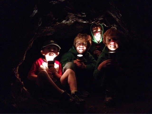
The next day we went to the Sitting Bull Crystal Caverns. I hadn't been in a cave since I was 6 or 7 so this also was a first of sorts for the whole family. We had to go 300 feet down into the cave and it was chilly!  It was well worth all the steps and the cold though.  It was hard to imagine that two boys found the cave when they were 9 or so while they were just out exploring in the 1930's. I can't imagine if my boys had found a cave like that!  People sure were adventurous back then. With my husband just having hip surgery not that many months ago he stayed out with our youngest and walked the nature trail. That was gorgeous also. The path wasn't very obvious so it almost felt like we were exploring in the hills just like those two boys from long ago.  It was a fun time. 


We recently watched one of my favorite movies, Dances With Wolves, as a family and I knew that we wanted to see something from the making of the movie on our trip.  We found just the thing at the Fort Hays Old West Town. Here they have the Fort Hays building that was on the set of Dances With Wolves!  It was so awesome to stand right where Kevin Costner stood in the movie and see the bullet hole in the window.  The boys also got to help make a rope. It was a great afternoon. 


Our trip wouldn't have been complete without a few photos taken of the prairie. I just love the wide open space. The first is my parents 'backyard' and the other two photos were taken as we drove down the interstate. 


Stay tuned for next week where I'll share a few more photos of our amazing trip. I'll leave you with my cute little boys. A couple of shots at my parents and one of their new haircuts done just today (nothing to do with our vacation but my parents will want to see). Thanks for stopping!


Wednesday, July 9, 2014

Wednesday Weekly- Stick with a Simple Color Scheme

Sorry I missed last week. We were enjoying a family vacation. It's always nice to get away, relax, enjoy time with family, and make memories. I'm hoping to have some photos from our vacation up for Photo Friday so be sure to check back later this week.

Today I have another PL layout to share. One thing I love about these PL layouts is that all the cards from kits coordinate so well together. Some times though I don't want to have tons of colors on my layout. Today's shows just that. I stuck with two basic colors, blue and yellow.  I used only cards with those colors and that made it very easy to put this page together.  Just because you are using only two or three colors doesn't mean that your page will be boring. You can also use various shades of those colors so your color palette is actually broader than you think. Here I've used three or four shades of blues and a couple of yellows which keeps the page from getting boring. 


Using black and white as your neutral colors really adds pop to the page. Here I used a stamp with black ink and white letters for that added pop. Layers are also another way to add some interest. 


I use my iPhone for documenting these everyday photos more often than my DSLR. That means I have a lot of vertical photos and I usually need some 4x6 filler cards. I decided to make my own for this layout. The yellow base card is actually the back from a card on the previous page. Adding a washi tape border, a stamp ombré style, and a couple of cards make this filler card fun. The 'simple & real' card was a 3x4 card that I cut to fit on the triangle 3x4 card. You know that I don't like to throw away so the piece I cut from that card is where the 'swimming' letters are on the above photo. 


Here are each page by themselves. 


Don't be afraid to use non PL items on your pages too. All of the Star Wars items are papers and stickers I had in my stash. They happened to be in the colors I needed and worked great on this layout.  And that large Star Wars title, that's from a shirt tag. Yes, I keep those too. ;) They make great embellishments.  I used a foldable journaling card to add more journaling of our family date night. Adding the pull tab allows you to pull it out and read more. 


I hope you've enjoyed this simple color scheme. The next time you are working on a layout and are stuck or want to try something simple I hope you'll give this a try. Thanks for stopping!

Supplies:
  • Project Life- Jade Core Kit and textured cards, Studio Calico PL Office Hours Kit (back of card), journaling pen 03-black, Design A page protector
  • stamps- Heidi Swapp, Basic Grey (Hello)
  • ink- Memento (Tuxedo Black)
  • alphas- Making Memories (Handwriting Sunsoaked), Lily Bee Design
  • patterned paper- Creative Imaginations (Star Wars)
  • cardstock- The Paper Studio
  • misc- Recollections (washi tape), vellum, Tim Holtz (Tiny Attacher)  

Wednesday, June 25, 2014

Wednesday Weekly- The First Installment!

As I am working on this blog post in the backyard, my boys are practicing to become American Ninja Warriors.  I love that technology has become portable so I can keep an eye on them and be productive at the same time.  The fresh air is a bonus too.

Today is the first installment of the Wednesday Weekly!  I'm hoping to share every Wednesday a new Project Life (PL) layout with tips, hints, and ideas. As with Photo Friday this may or may not happen every week but I will try to be consistent.  My goal with this is to not only give you, my readers, ideas but to keep me on track and continuing to get those pages done and in my album. Last week I gave you some tips on how I organized and printed my photos so let's put those photos to good use and create a layout!

I'm starting this section of PL pages in my album with the new year.  These are the most current photos I've worked with in a long time and it was really fun!  As I said last week I'm thinking of these PL layouts as a sort of photo journal. I wanted to include the highlights for our family during that first week in the new year. Here is my two page spread. 


I am getting quite the collection of PL supplies and not that I need anymore but I recently started a subscription to the Studio Calico Project Life kit. It is so fun having supplies delivered right to my front door every month!  As an added bonus I get to use supplies I might not normally buy which keeps those creative juices flowing.  I had already started this page when my first kit, Office Hours, arrived. I was so excited that the supplies in this kit matched the cards from the Honey Core kit I had already picked out!

To create my title card I cut a word bubble from a card in the Honey kit and used the polka dot card from my Office Hours kit.  I never use to cut apart a PL card but sometimes they just work better when you do. It also allows you some more artistic freedom. I loved using these word bubbles throughout my layout and cutting some cards allowed me to do just that. A tag stamped with the date and letter stickers from the Office Hours kit complete this title card. 


When I first saw this card in my kit it reminded me of fireworks and I knew that it had to go on this page.  I stamped the year in some white ink and that filler card was done. 


I love adding stamps to an already cute card to add just a little to the feel of the layout. This camera stamp was perfect for just that!


Another new love of mine is washi tape!  I really don't think you can ever have enough!  Be prepared to see washi tape used on most of these layouts. I'm warning you now. ;)  This card was just a plain card with a red border but by adding two kinds of washi tape, a cork sticker, and using a stamp I made a very cute home for this photo. 


I use my iPhone A LOT. Most of the time it does great but in those instances (like a dark movie theater) when it doesn't a photo app does the trick. I brightened this photo and it was the perfect memory of going to see Frozen!  Remember that your photos don't always have to be perfect. As long as they help tell your story include them!  I also added some old silver letter stickers from my stash to put the title of the movie on an unimportant part of the photo. This is a great way to add extra journaling or a subtitle if you don't have a lot of space. 
                             

I have found that I normally don't take a lot of horizontal 4x6 photos with my iPhone. That means I need to use smaller photos to fill up those spaces in my pocket pages. Textured card stock that is already cut to the 4x6 size is perfect for these photos. They come in sets that match the PL core kits too.  By adding a 3x4 card and some letter stickers I can easily full up this space in a fun way. 


Here are a couple of close ups of each individual page. 


I hope you've enjoyed this first Wednesday Weekly.  I hope to be sharing many more. Thanks for stopping!


Supplies:
  • Project Life- Honey core kit, Studio Calico Office Hours kit, Jade textured card, Design A pocket page, PL pen (03 black)
  • ink- Memento (Tuxedo Black), Close to My Heart (White Daisy)
  • stamps- My Mind's Eye (Chalk Studio), Teresa Collins (He Said She Said), Autumn Leaves (Cutesie Alpha), Basic Grey (Hello)
  • alphabet stickers- Basic Grey (Capture), American Crafts (Thickers Delight), Frances Meyer (Flower Pot Silver)
  • misc- My Mind's Eye (washi tape) 

Friday, June 20, 2014

Photo Friday- Captured Classics

Last week we finished our first session of swimming lessons this summer. All four of the boys passed!  They were so excited!  We decided as a reward we would grab some takeout and head over to Quaker Steak and Lube for classic car night. The boys loved it!  It was so fun to walk around and see all of the classic cars. This is one of the many reasons I love my iPhone. Not having planned this I didn't have my DSLR with me but was still able to get some great shots thanks to that handy little gadget. Enjoy and thanks for stopping!


Wednesday, June 18, 2014

Project Life Photo Organizing Process

This summer is just flying by!  Between camp, swimming lessons, VBS, and life in general we have been busy. That means lots of fun pictures but not lots of time to scrapbook them. That's why I'm excited to be trying a new way to scrapbook and loving it!

If you follow my Facebook page or follow me on Instagram you know that I have finally started a true Project Life (PL) album.  I've been using the cards and divided page protectors on layouts in my albums for awhile but they have all been single subject layouts. This new album I have started is in a weekly format and I have been loving it!  I take so many random pictures on my phone that normally would not 'make the cut' in my normal albums but work great in these weekly spreads. I'm using this format for our family album starting this year and love seeing what our weeks look like at a glance. I think of it as a photo journal of sorts. One thing I have changed from a normal PL layout is that even though I'm doing a weekly format I'm not labeling each layout Week 1, Week 2, etc.  The main reason for this is that our family albums are based on our anniversary which is at the end of June so my family album runs from July-June.  I don't feel that I need to label the weeks in that way but do put the date of each week on my layout.

I'm hoping to regularly share a PL layout each week on Wednesday and I'm going to start this week by showing you how I am getting everything organized to start working on these layouts and get them done quickly. I know this won't be very exciting but sometimes it's good to see what goes on behind the scene. I'm assuming you already have all the supplies needed (an album, PL core kit, page protectors, and a pen) so I'm leaving out gathering those things. I'm focusing on the photos and how I organize them and put a layout together.

My iPad is a huge help when it comes to organizing my photos.  I start by gathering all of the photos I want to use in my camera roll and then put them in folders based on the week they are from.  These photos are from both my iPhone and DSLR. I started at the new year even though this album will really start back in July (I'll go back and finish that later). I also worked with only three months of pictures so I wasn't overwhelmed. If you don't have an iPad you could do this in folders on your PC or if your photos are already printed just grab some envelopes and label them with your week on the front and put the photos inside. Here is a screen shot of what my folders look like. 
Once your photos are in folders you can then decide which photos to print and what sizes to make them.  I'm still perfecting this part of the process and I'm sure will change the way I do this but for now I decided which photos would be full 4x6 and which would be 3x4. To get my 3x4 photos on one 4x6 print I use the PicFrame app. Here is a great explanation on how to get those photos set up. I also use many Instagram photos and this time around printed them in two different sizes because I was not really sure which size would work best.  I've used both sizes on my layouts and will probably continue to do so.  Here is a peek inside a folder so you can see the large photos and the ones that I used with the PicFrame app. 
Once I have figured out all of my sizing I send the photos to print. I typically use Walgreens but this time around I tried out Costco. You could use any photo printing service or print them at home. Once they are printed now it's times to sort them back into physical piles that match the digital folders. 

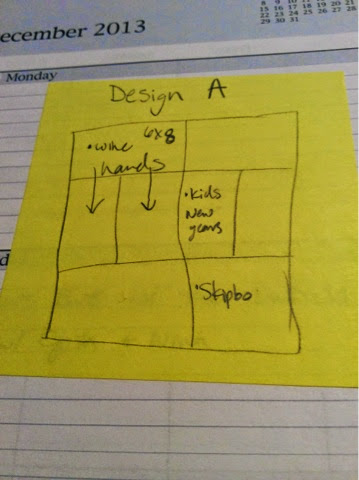
I guess I should back up a bit and explain how I decide which photos to print large and which to make smaller. I grab a pile of post it notes and my journal and decide which PL page protector I'll be using and actually sketch a page to put in the journal.  If you search on Pinterest you can find PL planning pages but I feel this works the best for me.  I jot down photo placement and use that as a guide to choose sizes and print the photos.  From here I put all of the page protectors in my album in order and place all the printed photos in one pocket on each week of the album.  These sketches of sorts might not be where the photos end up but it gives me a starting point. 

So that's how I work on getting my photos organized and ready to add to my PL album. If you've stayed with me this far kudos to you!  I know this is a little wordy and not super exciting. I just wanted you to see my process. Next week I'll share an actual layout. I promise. Until then thanks for stopping!