Tuesday, April 30, 2013

Shadow Stamping

I figured I better get this page up on the blog today while we actually have sun outside.  Our forecast here is calling for rain and possibly SNOW over the next few days!  I just can't believe the weather we are having this year.  I have seen snow before in June so anything is possible.

I knew that I wanted to use this song title by Timbuk3 (I had no idea who sang this) as the title for my page (changing 'the' to 'my') and do some fun things with it.  I love this super fun lined square stamp but knew that I wouldn't have enough room to do my whole title with it.  I decided to use that stamp to highlight the two most important words in my title, 'bright' and 'shades'.  Outlining the letters with a black pen really help those words stick out.  After punching them out with a square punch and rounding the corners I added a small piece of chipboard to the backs of these letters to help them stand out even more.  

I wanted to try something fun and something I've never tried with the rest of my title.  I love using shadow letters on my Cricut but I wanted to use a stamp for these words.  I decided to try to create shadow letters with two colors of ink and it worked!  After I put my letters on my acrylic block I inked them in the blue ink, stamped them on some paper, covered them with clear embossing powder, and heat embossed them.  Without removing the letters I then inked them with the grey ink.  I then lined my stamp up with the embossed letters, moved it slightly, and stamped.  (Having a Stamp-a-ma-jig would have made this much easier and I have since purchased one).  Then I dabbed the wet ink off of the embossed letters and I had a shadow!    I'm sure there are other ways to get a shadow effect but this way worked for me.  I just love the way it turned out!
I used some really bright paper to add to my theme.  I used only one piece of the patterned paper to make both of these layouts and four birthday cards!!  (I'll try to share those tomorrow).  A little ink around the edges and my pages were done!  Super fast and easy.  Don't forget that you can use patterned paper in place of photos in a sketch too.  It is a great way to fill up a page and still keep a clean look to your page.  

 I hope you enjoyed this fun technique and will try it on your pages and cards.  Thanks for stopping!

Supplies:
  • cardstock- misc
  • patterned paper- I got this from a friend sorry I don't have a manufacturer
  • stamps- Close to My Heart (Atomic Caps B1175, W189), Autumn Leaves (Snickety Alphas)
  • ink- Tim Holtz Distress Ink (Wild Honey, Pumice Stone, Broken China)
  • embossing powder- Ranger (Superfine Clear)
  • tools- We R Memory Keepers (corner chomper 1/8"), Fiskars (square punch 1.5")
  • pen- American Crafts (Project Life Journaling Pen Black 03)

Friday, April 26, 2013

Photo Friday- Practice Makes Perfect

What a week!  Sorry I haven't posted at ALL this week.  I've been at school and/or church everyday this week volunteering and practicing/playing for a funeral and a wedding.  Add in the nice weather (finally!) and a birthday and my week was shot.  I only think I picked up my 'good' camera once!  (insert a gasp here).  That brings me to my post today.  Practice Makes Perfect.

It's a phrase I'm sure we've all heard since we were little.  The only way to get better at something is to keep practicing at it.  I love my new camera but there are times that I get frustrated with it and think something is 'wrong' with my camera.  It's so easy to blame something or someone for our own failings.  When I was browsing though Pinterest one night I stumbled across an article that compared a camera to a musical instrument.  (I didn't pin this so I have no idea where it is).  That's when it really hit me.  I just haven't practiced enough!

I don't know why it took me so long to figure this out!  I am a musician.  I know that it takes many hours and even years to master your instrument.  Just because you get a new expensive, fancy, top rated instrument doesn't mean that you will automatically sound better.  Sometimes students can get frustrated with their instruments and want to upgrade so they will sound better.  This will not help if they haven't mastered their instrument.  This same concept applies to cameras.  Just because it has more buttons and functions doesn't mean your photos will automatically turn out better.  You still have to practice and learn your camera.  You need to know how it works to get it to respond and work for you the way you want it too.

Now I'm not saying that new equipment won't make a difference, it will, but if you really want to master your camera you need to practice.  And more than just once a week.  I need to practice.

So there you have it.  I need to practice.  Enough of 'blaming' my camera for things that I need to improve on.  I'm going to try to practice more and really improve my photo taking skills.  I have a great book for my specific camera that I read that has assignments at the end of each chapter to work on (practice) the skills in that chapter.  I'm going to do those assignments.  I'm sure that some of them will show up here on Fridays.  I'm going to play and experiment and practice until I get where I want to be.  If you want to improve your photography just remember.  Practice Makes Perfect.

I can't give you a Photo Friday post with no photos so here are just a couple of my birthday boy.  Enjoy and thanks for stopping!


Thursday, April 18, 2013

Guest Designer Challenge

I have been chosen this week to be a guest designer for the Weekly Challenge over at Playing in Paradise!  They have great challenges over on their blog and great prizes too!  This weeks challenge is Use Something Recycled.


When I first saw this challenge I really wasn't sure what I was going to make but I had some ideas floating around in my head.  My first thought was to use things that would normally be thrown away and use them in some way on my project, recycle them into a paper crafting item.  Here are the items I chose to use: large bubble wrap, chipboard from a board game, and ribbon from a store package.  

Believe it or not I've had all of these items in my stash for awhile now!  This was the perfect project to try them on.  Here is what I came up with. 
Isn't that a fun and cheery card?!  I was again in a monochromatic mood when I made this and used three shades of Distress Ink to match my ribbon creating an ombre effect.  I inked the bubble wrap and then placed my white cardstock over it and pressed down really well.  I then covered it with clear embossing powder and heat embossed the whole background.  I just love how it turned out!  After embossing I used my ink blending tool and added the lightest ink over the whole image so that my paper had a pink tint to it.  I also inked the edges with the darkest color and embossed those as well.   
As for the 'buckle' it was cut from the chipboard piece!  I used my Corner Chomper to round the corners and sanded the edges to get rid of any rough spots.  I then covered it with a few coats of white paint followed by a few coats of Distress Stickles Clear Rock Candy.  I love the texture the paint and stickles add to this (it's hard to see in the photo).
I stamped the sentiment on a scratch piece of paper and heat embossed it as well.  I also used my ink blending tool to give a pink tint to the paper.  Adding a few pink gems really gives this card an extra bit of glam.  So fun!!

I hope you enjoyed this 'recycled' card.  Stop by the Playing in Paradise Challenge and play along.  I'd love to see what kind of projects you make using something recycled!  Thanks for stopping!

Supplies:
  • cardstock: misc
  • stamp:Hero Arts (Box of Words)
  • ink: Tim Holtz Distress Ink (Spun Sugar, Worn Lipstick, Picked Raspberry)
  • embossing powder: Ranger (Superfine Clear)
  • paint: Delta Creative (Magnolia White)
  • stickles: Ranger Distress Stickles (Clear Rock Candy)
  • gems: Queen & Co. (Orchid)
  • tools: We R Memory Keepers (Corner Chomper 3/8"), sanding block
  • misc: ribbon, leftover chipboard game piece, bubble wrap

Wednesday, April 17, 2013

Sweet Memories

I'm here with another quick Project Life layout today.  This is the back of the previous PL layout that I did.  The best thing is that this layout took even less time than the last one!  This is as simple as it gets.  Just put in the photos, journal, and you are done.  I didn't add any additional products to this layout.  Just the PL core kit elements.  I even used the back of some of the cards on the previous page so I didn't even have to insert some of the filler cards!  I love how simple this is.   
Just a little note that there will not be a Photo Friday post this week.  Remember this embossed card I did last week?  Well, my card was picked as the winner over at Playing in Paradise and I get to be a guest designer over on their blog this week!!  It's a super secret challenge so you'll have to come back Friday to see what I created and play along.  See you Friday and thanks for stopping!

Supplies:
  • Project Life (Jade kit)
  • Project Life journaling pens (black 05)
  • tools: Creative Memories (corner rounder)

Monday, April 15, 2013

How To Make a Paper Rosette


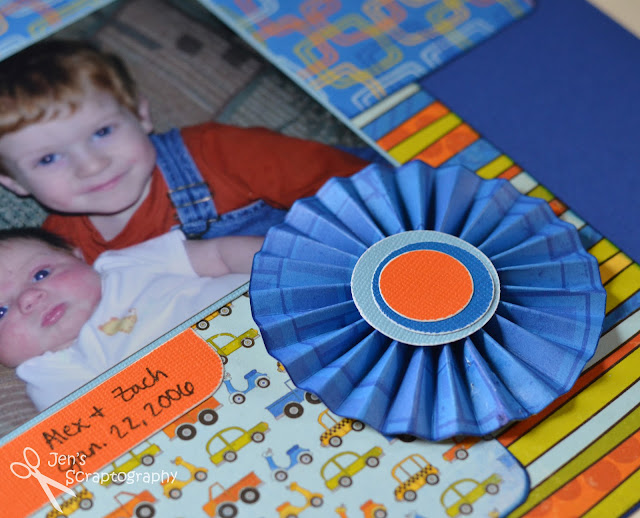
I have a fun technique to share with you today, how to make a paper rosette.  These rosettes are super easy to make and are a great embellishment on your scrapbook page or card.  I love the little bit of extra that they give this scrapbook layout.

Start with a strip of cardstock 12" x 1 1/4" and score every 1/4". A scoring board and bone folder work great for this. If you don't have a scoring board you can use your paper trimmer. Move the cutting blade to the opposite end and use a bone folder or embossing stylus in the cutting guide to score your paper. 

I then added some ink to the edges of my paper for some added interest.  You could also use a border punch to add a decorative edge to your rosette.  I bet you could even tear the edges of the paper for a more rustic looking rosette (I might need to try that sometime).    


After you've finished with the edges accordion fold your paper so it looks like this:
Once you have your paper folded you need to attach the edges together to form a ring.  In the past I've used a stapler but this time I tried Glossy Accents.  It worked great!  You just have to hold the edges for a bit while it dries.  You could also use your favorite dry adhesive but I really like the hold of the Glossy Accents.  

Now comes the trickiest part.  Using both hands, gather the paper in the middle and push down to form your rosette.


Once your rosette is formed it will need to be glued to something so that it doesn't pop back.  I using Glossy Accents and a piece of thin chipboard punched with a circle punch.  They work great for keeping the rosette together.  Just apply Glossy Accents to the chipboard circle, place on the backside of the rosette, and let dry.   


You will need to add a circle to the center of the front of the rosette as well.  I used this piece of patterned paper from the paper kit I was using as inspiration for my centers.  I cut out three different sized circles from cardstock, lightly sanded the edges, glued them together off center, and then glued them to the front of my rosette again using Glossy Accents.  I just love how they turned out.  Use your imagination here.  You really can add anything to the centers of the rosettes depending on the look you want.     


Here is my finished rosette:
I just love how it turned out!  So fun!  You could also use different widths of paper to make rosettes of different sizes.  This rosette when finished is approximately 3 1/4" in diameter.  

Here is one more closeup of the rosette on my scrapbook layout.  Such a fun and cute way to add a little dimension and interest to your layout.
And a close up of one of the awesome titles from the Boys Will Be Boys cartridge.  I just love the different layers this title has.  I also love that I can customize my title to go with my layout.  A perfect match every time!

Thanks for sticking with me on this lengthy post today.  I hope you'll give making a paper rosette a try.  Thanks for stopping!

Supplies:
  • cardstock- The Paper Studio (Textured Cardstock Brights), misc
  • patterned paper- BoBunny (On the Go Collection)
  • Cricut cartridge- Boys Will Be Boys
  • ink- Quick Quotes Powder Puff Chalking Ink (Blue Moon)
  • adhesives- 3L (3D Foam Squares), Ranger (Glossy Accents)
  • tools- Perfect Layers, sanding block, Creative Memories (circle cutter), Martha Stewart (score board), We R Memory Keepers (corner chomper 3/8"), bone folder
  • pen- American Crafts Project Life Pens (black 08)


Saturday, April 13, 2013

Photo Friday- Part 2

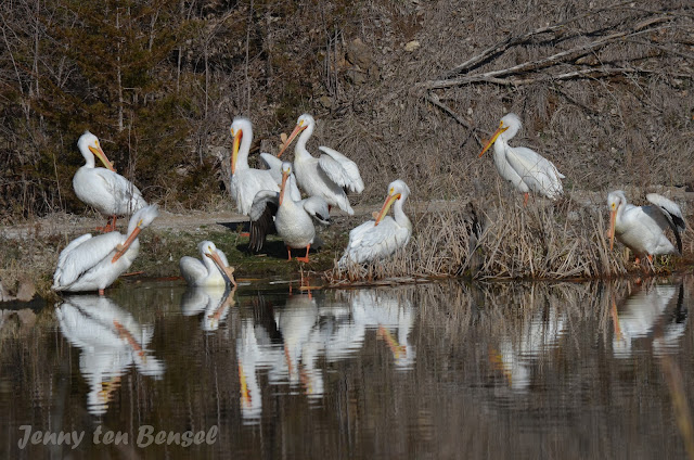
Today was the final day of a two day photography class so I thought I'd share a few of my favorites from the Wildlife Safari.  Thanks for stopping!


My fellow photog friend, Dina, also took this class and is sharing my blog with her friends so I'm going to do the same!  Go check out her AWESOME photos over on her blog: http://photographybydinaturco.blogspot.com 
She got some AMAZING shots.  Enjoy!!

Friday, April 12, 2013

Photo Friday- Playing With Perspective

Today I took a photography class at our zoo.  I know what you are thinking.  More zoo pictures?!  I know I post them way too much but I just love the zoo.  Anyway, I wanted to share with you the two most important things I learned at that class: 1) It's way easier to take awesome photos at the zoo without your children along.  2) Perspective matters.

So the first one is kind of a joke but still so true.  I really can't take the time to sit and change settings and wait for the 'perfect' moment to take a photo when I'm also watching my four boys.  It was so refreshing to be able to JUST TAKE PHOTOS.  As the boys get older and are all in school I think that I may just visit the zoo by myself.  :)

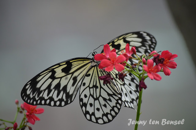
As for perspective.  I knew that perspective mattered.  I didn't really learn that but I learned to think of it in a new way.  We have a great butterfly house at our zoo.  I love to try to get pictures of the butterflies with their wings open.  Doesn't everyone?  That's the point.  Try to get a different perspective that not everyone is getting! 
Aren't those fun!  I just love the different angles I got and am so glad that our teacher mentioned this. 

Another thing we talked about in class is making the animals look like they are not in the zoo.  Make them look natural.  This is not a new concept to me but was a lot easier to think about without the kids.  I could move to different positions to get the shot I wanted. 
Good looking cat.  Bad looking door.  
Same cat.  Different angle.  Much better but not perfect. 


Same cat.  Zoomed in close.  Lose the background.  Love it. 

In all the cat examples the cat looked good.  What makes the bottom picture better than the other two is that it doesn't look like he's in a zoo.  So, if you can, think about what's in the background.  Sometimes this is easier said than done. 

And finally just some adorable lion cub pictures.  This one was really loving all of the attention.  Thanks for stopping and I hope you'll play with perspective the next time you go out with your camera. 


Wednesday, April 10, 2013

Finally Trying Out Project Life!

7 minutes 48 seconds.  That is how long it took me to create this layout start to finish.  Let me say that again.  I finished a layout in under 8 minutes!!  I'm sure this is a record for me.  I can easily spend that much time trying to pick out the right paper for a layout (just ask my friends).  I'm sure that I will spend more than 8 minutes writing this blog post.  Project Life is fast.     

If you haven't heard of Project Life before you can learn about it here.  This is my first time using Project Life.  I've followed Becky Higgins for many years and love her products.  I wasn't sure I would like Project Life though.  I loved the concept but wasn't sure it was for me.  I love creating scrapbook pages and I have a room full of supplies.  This just seemed too simple, too easy.  I've been wanting to try it for awhile but really wanted to see it in person before I ordered it.  When I heard it was going to be on HSN I knew that this would be the time to get it and try it out.  So I ordered the Jade kit. 

Once I opened the box I knew that I would enjoy this style of scrapbooking too.  Yes, it is simple and easy and that is what makes it great.  This was my first layout using these products so I wanted to time myself and really see how fast and easily I could put a page together.  The only thing that I did to prepare the page was get my pictures out, grab a page protector, and open my Jade Project Life kit.  Then I started my timer.   

My first step was to round the corners of my pictures and crop the small picture.  This step took 1 min!  Can you believe that if I wouldn't have rounded the corners of my pictures this page would have been done in less than 7 minutes!  Then I slipped the photos in the spots I wanted them in.

My next step was to fill in the empty spaces with filler cards.  This probably took the most time because I was looking for cards that complemented my photos.  The colors in the Jade kit are beautiful and very gender neutral.  I hadn't really looked through all the cards before so I got a little distracted while looking for my filler cards.  :)

Once I had the filler cards picked I did some quick journaling using the Project Life pens.  LOVE these pens!!  They write very nice and they come in an awesome case!  A little tip about my journaling.  I have kept daily journals for all of my boys since they were born.  Just a little note about their day/what we did.  These journals are life savers when it comes to my scrapbooking.  I would never remember details if I didn't have them written down in these journals.

My page still needed a title so I went over to my stickers and pulled out some large black alphabet stickers (these are both really old and probably no longer available).  I was still racing against the clock so I wasn't too picky.  I pulled out some stickers and used what letters I had to make my title.  I used the empty space on one of the large photos to place my title.  This not only gave my title a place but it filled an empty space in a not so great photo.

I then put the filler cards and title photo in the sleeve and I was done!  So simple, so easy!  Anyone can use this method to scrapbook.  I will be using this method to scrapbook, just not all the time.  I'm not 'switching' to Project Life but I am going to use it as a supplement in my scrapbooks.  I'll still do 'normal' layouts but will be throwing Project Life pages in the mix.  Some will be simple like this and others will be a little more embellished.  It will just depend on my mood (and time).

I hope this gives you a little idea of how Project Life works and how I plan on using it.  I know that I'm excited about getting some pages done quickly using Project Life.  If you use Project Life I'd love to hear how you use it.  Thanks for stopping!

Supplies:
  • Project Life (Jade Edition)
  • Project Life Journaling Pens (black 03)
  • alphabet stickers- NRN Designs, Wordsworth (Ragged Brush)
  • tools- Creative Memories (corner rounder)

Tuesday, April 9, 2013

Embossed 'Hi' Card

Once again I'm Playing in Paradise this week.  Their challenge this time is embossing.  Embossing is such a great way to add dimension without a lot of bulk!  I needed to send a quick note with some pictures and this simple one layer card is what I came up with.

I first embossed a piece of cardstock with the Moroccan Screen embossing folder.  I then sanded the surface and edges to let a little of the white core show through.  This adds both dimension and interest.  I knew that this card would be going in the mail so the flatter the better.  I used a piece of double sided tape and some glitter to add a quick ribbon like effect in a similar color.  I love using a monochromatic color scheme to make simple cards even simpler!
For the flower I used the reverse side of the textured cardstock.  This left me with a smooth surface for stamping on.  I used Ruby pigment ink to stamp the flower and clear embossing powder.  Once I heat embossed the flower I then cut it out and sanded the edges.  This helped to set it apart from the embossed background.  I used the same ink to stamp the sentiment on a piece of scrap paper and also heat embossed both the sentiment and the edges of the circle. 

I hope you enjoyed my simple, embossed card today.  The next time you need to make a card with a lot of impact but not a lot of bulk, think about embossing.  I think you'll be happy with the results.  Thanks for stopping!

Supplies:
  • cardstock- The Paper Studio (Textured Cardstock Darks), misc scrap
  • stamps- Autumn Leaves (Flowers), ScrapAce
  • ink- Colorbox Pigment Ink (Ruby)
  • embossing powder- Ranger (Superfine Clear)
  • embossing folder- Provocraft (Moroccan Screen)
  • tools- Creative Memories (circle cutter), We R Memory Keepers (Corner Chomper 3/8"), sanding block
  • misc- double sided tape, glitter- Recollections (Garnet)  

Friday, April 5, 2013

Photo Friday- Spring Has Sprung!

Sweatshirts, shades, sniffles, sneezes, seeds, and sunshine.  Spring has finally sprung!  Here is how spring is looking in our neck of the woods.  I hope you are able to get out and enjoy it.  Thanks for stopping!