Wednesday, September 25, 2013

Tummy Time Layout

I have a fun layout for you today that features a cute paper line by Little Yellow Bicycle called Babysaurus.  I just love the cute dinosaurs and the beautiful colors.  Let me show you what I created! 

I had these three photos of my son that I really wanted to feature.  I love clean block type layouts so a row of the three photos was the way to go.  I then had space on either side of the photos to fill.  I used that space to place embellishments, a title, and my journaling.  After picking three patterned papers from this line I got to work!
This paper line is adorable!  I just love the dinosaurs and knew that I wanted to feature one as an embellishment.  I fussy cut around this guy leaving a small white border.  I then placed him on one of the patterned papers matted with white cardstock.  A corner chomper and some brads finish off this adorable addition to the page. 
I also used some popdots to add some dimension.  I love how it stands out on the page.
Banners are in right now so I wanted to include some on my page.  This was the perfect spot to add my title.  Using the same blue and orange paper I made two banners.  The different lengths and widths add some fun to the page.  I also used more brads to tie this area with the embellishment and journaling spot.  I also used both the blue and orange paper in all three spots.  This creates a visual triangle to lead you around the page.   
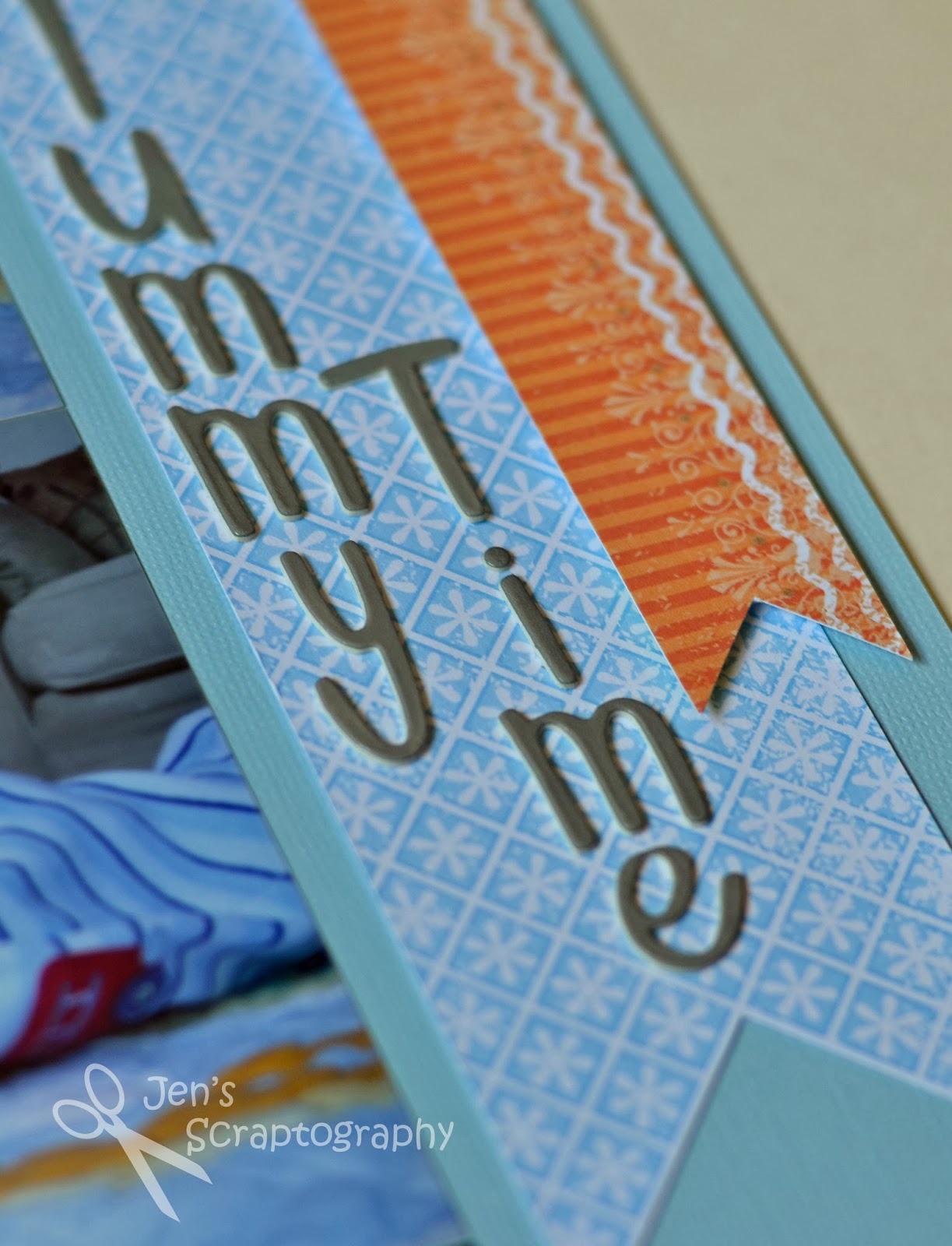
Here is a closeup of these great Thickers I used for my title.  Both the font and color were just perfect for this page!   
I love how something as simple as a brad can have such a big impact.  I have so many brads and I'm always glad when I use them on a page.  I also used my Gellyroll Stardust pen to add a little sparkle to the orange paper.    
I love to journal on vellum.  Sometimes I'll print journaling on my computer but a lot of times I like to use my own handwriting.  I have a great tip for keeping that journaling straight.  I took a piece of notebook paper and traced all the lines with a black marker using a ruler.
When I want to journal on the vellum I just place it over the lined notebook paper and now my journaling is perfectly straight!
And just because he's so cute here is one last view of that little dinosaur.  Thanks for stopping!!

Supplies:
  • cardstock- The Paper Studio (Textured Cardstock Brights)
  • patterned paper- Little Yellow Bicycle (Babysaurus)
  • alphabet stickers- American Crafts Thickers (Kensie Shadow)
  • tools- We R Memory Keepers Corner Chomper (Stub/Deco)
  • pens- American Crafts (Project Life Black 03), Gellyroll (Stardust)
  • misc- brads, vellum, popdots


Friday, September 20, 2013

Photo Friday- Don't Forget the Details

I had the honor to photograph a joint 40th birthday party last weekend.  The couple wanted some photos to remember their fun time with family and friends.  I was able to get lots of photos of them interacting with their guests and all of the children playing on the playground but I also captured some details for them.  Mostly of the food!  It's so easy to take photos of all the people but even little details like a leaf on the ground or a dripping can of pop can bring back memories of special days.  I see this detail in many wedding photographs now.  Photos of all the little things.  I wish I had more of those from my own wedding!  So the next time you are taking photos at a party don't forget the details, snap a picture of the food, the wrapping paper mess, prizes for a baby shower game, etc.  You'll be glad you did and so will the hosts of the party.  Chances are they were so busy entertaining their guests that they missed out on all of these little details.  Thanks for stopping!


Wednesday, September 18, 2013

Watercolor Floral Birthday Card

I had a challenge last week.  Our family was invited to help some friends celebrate their 40th birthdays.  Of course I had to make them a card but what to do for a couple for a birthday card?  I thought about this for awhile.  I didn't want the card to be too feminine or masculine.  Since he likes gardening I decided I could get away with a floral themed card.  Let me show you what I did.

I looked through my stamps and found this stamp.  Not one I would normally use but it reminds me of a garden and also a great fabric pattern.  I stamped it on watercolor paper using StazOn ink and then colored it using watercolor pencils and a waterbrush.
After I trimmed around the edges of the colored image I inked the edges with Black Soot ink.  I love to ink the edges of things to give them a more finished look.  
I really wanted the emphasis on the floral panel so the rest of the card is fairly simple.  I got out some black cardstock and a wood grain embossing folder to use as a background.  I lightly sanded it just to let a little of the white core show. 
I cut out Happy Birthday using my Cricut and after covering with embossing ink I covered it with white embossing powder to give the sentiment just a little bit of shine.  Because I used dimensional adhesive to attach the floral panel I used some Glossy Accents to attach just the edge of Happy to the panel.  This is a great adhesive for small areas such as this.  
Here is the completed card.  Aside from the watercoloring this card is fairly simple, but I think it has a very dramatic effect.  I love the pop of color against the black and the black woodgrain also helps keep this card from being too feminine.  I hope you enjoyed this card too.  Thanks for stopping!

Supplies:
  • cardstock- The Paper Studio (Textured Cardstock Darks), watercolor paper, scraps
  • Cricut cartridge- Gypsy Wanderings
  • stamp- Tapestry Panel N6018
  • ink- Tsukineko (StazOn Jet Black), Tim Holtz Distress Ink (Black Soot, Embossing)
  • embossing folder- Darice (Wood Grain)
  • embossing powder- American Crafts (Zing White)
  • misc- Faber-Castell watercolor pencils, Ranger (Glossy Accents), dimensional adhesive, sanding block, waterbrush

Monday, September 16, 2013

Stamped Flower Birthday Card

Where do you find the inspiration for the cards and projects you make?  Sometimes I look in magazines or online and sometimes I need to look no farther than my bathroom cabinet.  Yes, my bathroom cabinet.  The packaging for some Pampers baby wipes was all the inspiration I needed to create this card.  Let me show you how. 

I was using this packaging as inspiration for both my color choices and as my stamping inspiration.  First, I started by getting out some inks in the colors I wanted to use and pulled out stamps that had circles and dots.  I had a lot of these stamps!  That gave me a lot of options to stamp my flowers with. 
I wanted this to be mainly a one layer card so I knew that my sentiment would have to somehow stand out against all of the stamped flowers.  I used some masking paper and stamped a border that my sentiment would fit in.  I cut out the shape and then applied that to my card where I wanted the sentiment to go.  Now it was time to start stamping!
I had this huge circle stamp that I love but I wanted to be able to stamp the outer circles and inner circles in two different colors.  I could have very carefully inked only part of my stamp or if I had stamping markers I could have colored on my stamp.  Both of these seemed too time consuming so I took a different route.  I cut my stamp.  Yes, I cut my stamp.  Did you know you could do that?  I used a sharp razor blade and carefully cut apart my stamp into two stamps.  I now had an inner set of circles and an outer set of circles.  This allowed me be able to stamp the four rows of circles in two different colors very easily!  If I want to use my stamp all as one I just have to put the inner piece back in and the stamp is as good as new. 
I then started stamping!  I used different stamps and colors of ink varying the height of the flowers to cover the front of the card.  I used some post it notes to cover the back of my card so it could lay flat while I stamped.  Some of my stamps were a little blotchy because I hadn't used them before and I should have sanded them a little.  I was on a time crunch though so I just let the whole look of the card be a little more distressed than crisp.  

Once I was happy with my stamping I removed the masking paper.  Now I had the perfect place to put my sentiment!  
I stamped the same shape that was on the masking paper right on the card by lining up the stamp using my Fiskars Stamp Press.  I next got out my Stamp-a-ma-jig and stamped my sentiment inside the border.  I love how it looks like it is standing out from the card but is really at the same level.  So fun!    
I needed one final touch to my card so I got out this little butterfly.  A little stamping, ink, and some gems and it was ready to fly.  This butterfly is in a little stash I keep on my craft table of left over supplies from other projects.  Bits of string, pieces of chipboard, and other cut out items are in a bowl and ready for me to grab.  Why throw it away when it may be perfect for another piece of art!  I attached the butterfly only on the middle with Glossy Accents and lifted it's wings up so it appears to be flying.  A little hand drawn flying trail finishes it off.   
Here is the whole card.  I love how it turned out!  I hope you will look around your home and find some unexpected inspiration.  If you find something great I'd love to hear about it.  Thanks for stopping. 

Supplies:
  • stamps- Close To My Heart (Beauty W2007, Star Struck D1237), Recollections (Circle It), Inkadinkado (Circle and Dots), My Minds Eye (Dilly Dally "Adventures" Stamps), Fiskars (Garden Borders), Martha Stewart (Half Labels), Great Impressions (background stamp on butterfly), Stampin' Up! (sentiment)
  • ink- Close To My Heart (Baby Pink, Sunkiss Yellow, Key Lime, Heavenly Blue), Tim Holtz Distress Ink (Broken China, Frayed Burlap), Inkadinkado (Cool Pastels Pigment Ink- Sea Green, Aqua)
  • tools- Inkadinkado (Stamp-a-ma-jig), Fiskars (Stamp Press), We R Memory Keepers (Corner Chomper 3/8"), Imaginisce (I-Rock)
  • misc- Imaginisce (I-Rock gems), Ranger (Glossy Accents)
  

Friday, September 13, 2013

Photo Friday- Cute Country Cousins

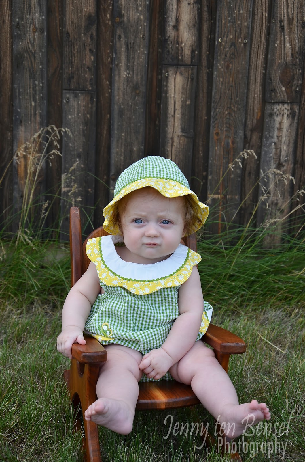
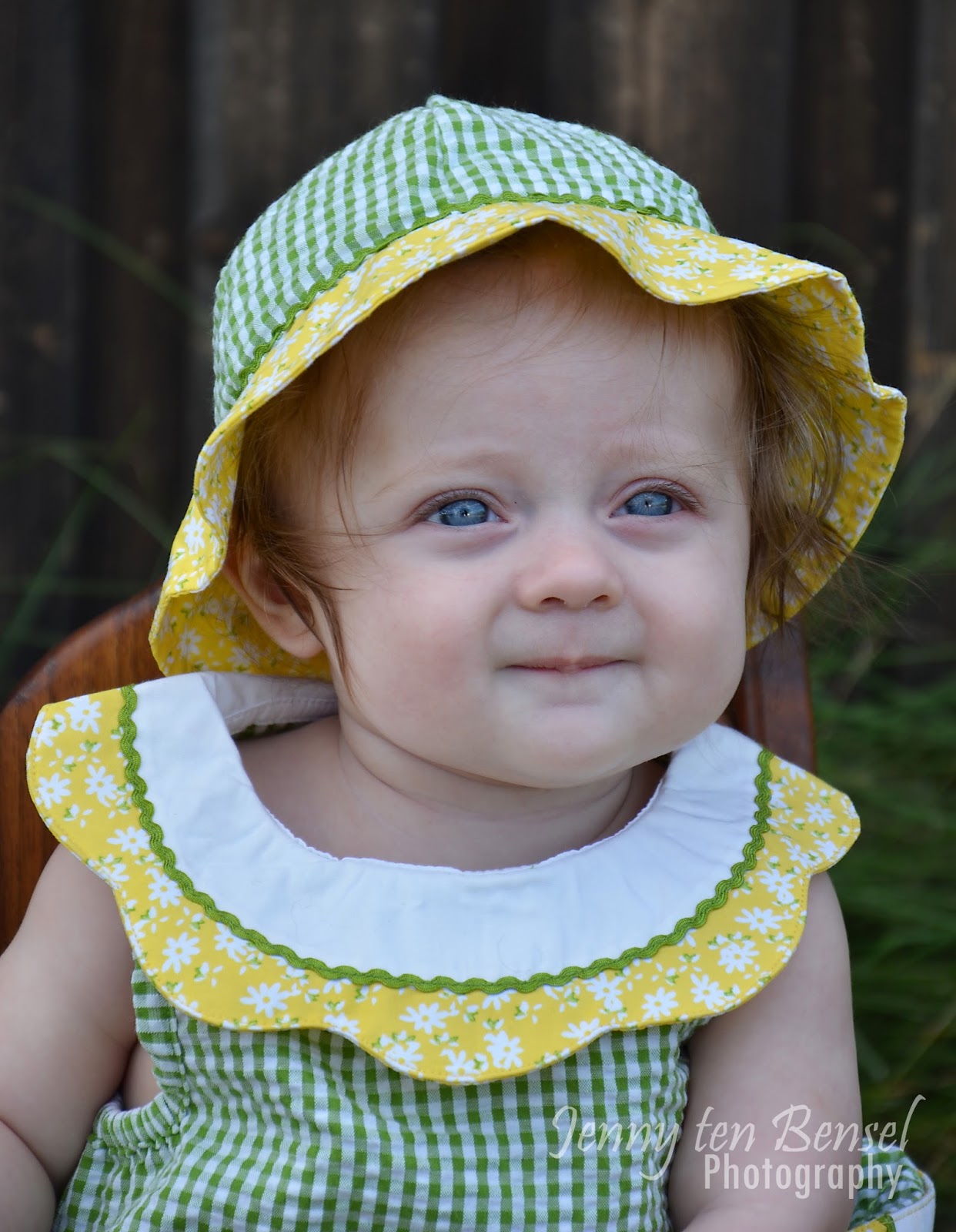
I have been waiting forever to get these photos taken.  It all started with this adorable little outfit I bought when I was pregnant with my second child.  It was John Deere colors and so cute.  We didn't know if we would be having a boy or a girl but it was on clearance so it came home with me.  I had visions of my oldest son in a John Deere shirt and the baby in this.  We ended up having a boy so in the closet it sat.  Then we had another boy and another.  I figured this outfit would never get used but then my brother and his wife had a girl.  Needless to say I couldn't wait until she fit into this outfit and we could do this photo shoot!  Luckily everything fell into place over the summer.  So with John Deere hats on heads we headed out to snap some pictures.  Let me just say that trying to get 5 pairs of eyes on you with good looking faces is not the easiest thing.  A couple other cool things about this shoot.  The little rocking chair was made by my grandfather (the kid's great grandfather) and the backdrop is the side of a building my dad (their grandfather) made.  I love all of the family history in these photos.  So here are my favorites from our little session.  I hope you enjoy.  Thanks for stopping.         


Wednesday, September 11, 2013

Combining Project Life with a Traditional Layout


I know it's summer out but in scrapbook land I'm in winter of 2006!  Here is a fun layout I did combining a traditional layout and a Project Life (PL) page.  I also used some fun techniques and am using the sketch from Playing in Paradise.  Lots going on so let me share what I did!

I've been sitting on these pictures for a while not sure what I wanted to do with them.  I recently purchased the Honey and Kraft editions of PL and couldn't wait to use them!  The gold colors in the Honey edition matched my son's coat perfectly and the rest fell into place from there.  I started this page with a PL page protector (Design A).  I added my photos where I wanted them and then went to work on my title and filler cards.  I love how the honeycomb works with this layout even though it's more of a 'summery' pattern.  Don't be afraid to try patterns with different seasons for a different look.
I had a lot of fun with my title card.  As I already mentioned I love the honeycomb pattern!  I just needed to add some touched to make it a bit more wintery.  White glitter Thickers and Jolee's sparkly snowflakes were just the right touch.  I also used some small letter stickers to add more detail to my title and carry the teal color from one of the filler cards.   
I LOVE the dimension that Thickers give to your page.  They come in so many styles and colors too that there is a great alphabet for every project! 


I used a journaling card with the same golden color so that your eye would move from the title card to the journaling card.  I also added another snowflake (mostly because it was the last one in the package).  I've really been trying to use up supplies I have before purchasing new ones and I was glad to finally use up these snowflakes!
For the other side of my layout I needed to make a traditional page because of how it will fit in my son's scrapbook.  I had two 4x6 photos and a lot of white space because the PL page had my title, journaling, and a lot of photos.  I stumbled upon a sketch challenge over at the Scrapbookers Paradise Blog.  I of course had to play along since it fit perfectly with what I was looking for.
I love how this half of the layout turned out and I also love how I was able to connect the two sides of the layout using completely different supplies.  I needed to have some of that gold honeycomb on this side of the layout to really connect the two pages.  I remembered that I had purchased a honeycomb embossing folder that I hadn't yet used so I pulled that out.  It worked perfectly!  I found some gold paper, embossed it, and then ran some White Daisy pigment ink over the top.  A perfect match!!  Now that I had the gold honeycomb on both pages I needed to get the blues from the journaling card over on this side as well.  I went through my stash of cardstock and found two matches that I used to mat my photos.  I kept the corners on these pictures and photo mats square to contrast with the rounded corners of all the other elements.  This really sets them apart and lets you know that these are the main two photos of the layout.  Adding some pop dots helped with this too. 

Now it was time to fill in some space and add some finishing touches.  I still had three snowflakes left so it was obvious where they needed to go but they were small and needed a little extra something.  I got out some grey ink and stamped a snowflake on white cardstock.  The snowflake stickers fit perfectly in the stamped snowflakes!  I punched them out with a circle punch and had some unique custom made embellishments that tied in with both pages without distracting from the photos.  A silver and white ribbon adds to the snowy sparkle effect and really completes this page.  

Here is the finished page together.  I love how it turned out and how both pages tie together even though they are made using different products. 
I hope you enjoyed this traditional/PL page.  I know that I will be doing more layouts like this in the future.  It's a good mix for me.  I hope you'll try a layout like this too using your PL and other supplies you have laying around.  Thanks for stopping.

Supplies:
  • cardstock- misc, The Paper Studio Textured Cardstock (Darks)
  • Project Life supplies- Honey Edition, journaling pens (black 03), Design A
  • alpha stickers- Lily Bee Design (Destination Letter Stickers), American Crafts Thickers (Delight)
  • ink- Close to My Heart (White Daisy), Studio G
  • stamp- Inkadinkado (Snowflakes)
  • tools- We R Memory Keeper (Corner Chomper 3/8"), Perfect Layers, EK Success 1 1/4" circle punch
  • embossing folder- Darice (Honeycomb Background)
  • misc- EK Success Jolee's Boutique (Snowflake Repeats), ribbon, dimensional adhesive