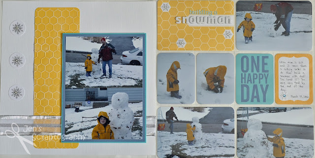
I've been sitting on these pictures for a while not sure what I wanted to do with them. I recently purchased the Honey and Kraft editions of PL and couldn't wait to use them! The gold colors in the Honey edition matched my son's coat perfectly and the rest fell into place from there. I started this page with a PL page protector (Design A). I added my photos where I wanted them and then went to work on my title and filler cards. I love how the honeycomb works with this layout even though it's more of a 'summery' pattern. Don't be afraid to try patterns with different seasons for a different look.
I had a lot of fun with my title card. As I already mentioned I love the honeycomb pattern! I just needed to add some touched to make it a bit more wintery. White glitter Thickers and Jolee's sparkly snowflakes were just the right touch. I also used some small letter stickers to add more detail to my title and carry the teal color from one of the filler cards.
I LOVE the dimension that Thickers give to your page. They come in so many styles and colors too that there is a great alphabet for every project!
For the other side of my layout I needed to make a traditional page because of how it will fit in my son's scrapbook. I had two 4x6 photos and a lot of white space because the PL page had my title, journaling, and a lot of photos. I stumbled upon a sketch challenge over at the Scrapbookers Paradise Blog. I of course had to play along since it fit perfectly with what I was looking for.
I love how this half of the layout turned out and I also love how I was able to connect the two sides of the layout using completely different supplies. I needed to have some of that gold honeycomb on this side of the layout to really connect the two pages. I remembered that I had purchased a honeycomb embossing folder that I hadn't yet used so I pulled that out. It worked perfectly! I found some gold paper, embossed it, and then ran some White Daisy pigment ink over the top. A perfect match!! Now that I had the gold honeycomb on both pages I needed to get the blues from the journaling card over on this side as well. I went through my stash of cardstock and found two matches that I used to mat my photos. I kept the corners on these pictures and photo mats square to contrast with the rounded corners of all the other elements. This really sets them apart and lets you know that these are the main two photos of the layout. Adding some pop dots helped with this too.
 Here is the finished page together. I love how it turned out and how both pages tie together even though they are made using different products.
 I hope you enjoyed this traditional/PL page. I know that I will be doing more layouts like this in the future. It's a good mix for me. I hope you'll try a layout like this too using your PL and other supplies you have laying around. Thanks for stopping.
Supplies:
- cardstock- misc, The Paper Studio Textured Cardstock (Darks)
- Project Life supplies- Honey Edition, journaling pens (black 03), Design A
- alpha stickers- Lily Bee Design (Destination Letter Stickers), American Crafts Thickers (Delight)
- ink- Close to My Heart (White Daisy), Studio G
- stamp- Inkadinkado (Snowflakes)
- tools- We R Memory Keeper (Corner Chomper 3/8"), Perfect Layers, EK Success 1 1/4" circle punch
- embossing folder- Darice (Honeycomb Background)
- misc- EK Success Jolee's Boutique (Snowflake Repeats), ribbon, dimensional adhesive


Thank You for playing in paradise with us this month. Love your take on our sketch. Four handsome boys!! you must have your hands full!! Keep smiling and creating.
ReplyDeleteFantastic layout! You did a brilliant job tying the two pages together. I love how you 'winterized' the honeycomb pattern and the pretty custom layered snowflakes. Really beautiful. Thanks so much for Playing in Paradise with us!
ReplyDeleteHugs, Dawn
I love this, Jenny!
ReplyDelete