Labels

Showing posts with label Scrapbooking. Show all posts

Thursday, April 10, 2014

Sitting Up Layout

Sorry I haven't posted in a while.  We have been busy here.  My second son celebrated his First Communion a few weekends ago so we were preparing for that.  I'm hoping to have a few pictures from that up tomorrow.  With that celebration came company!  That kept us busy.  We had five extra people in the house for a total of 11!  We all survived even with only one bathroom!  Last week my husband had hip surgery.  He had a tear fixed and some excess bone shaved off.  He is doing well and is in recovery mode so that has changed our schedule a bit.  Enough of why I haven't been on here.  Let's get to the fun stuff!

I have really been thinking about my scrapbooking style and getting those pictures on pages and in my albums.  If you've been following me you know that I'm WAY behind (in scrapbook land it's 2006).  I'm OK with that but I do want to start making a dent in getting those memories in our albums.  Soon I'm going to be starting a current Project Life album and I can't wait!  I'll post more about that soon.  In the meantime, these older photos need to be scrapped and put in their albums.  If you remember one of my New Year's goals was to use up supplies I had before buying more.  I will admit that I have purchased a few supplies here and there.  I just can't help myself!  I've also started a subscription to the Studio Calico monthly Project Life kit.  I will be using this for the above mentioned current album to be started soon.  I tend to keep supplies around for the 'perfect' page.  I don't want to use up the good stuff on photos that aren't so great.  I've decided to change that attitude.  Even if the photos aren't stellar if I printed them to go in the album they are worthy of great paper.  That's where today's layout comes in.

I'll be the first to admit that these are not great photos.  They were taken at a weird angle, have not so great lighting, and have my head in the corner (my husband took these).  These photos do, however, tell an important story of my son sitting up for the first time on his own.  This is the same son that just celebrated his First Communion!  Also, when working with these older photos I tend to just order 4x6 prints as is.  No editing or cropping.  This makes the ordering process easy but can lead to some strange sized photos.  I would have preferred one of the other photos to be large and have the looking away photo smaller but that's not what I got.  I guess what I'm saying is embrace even the not so perfect photos and treat them with the same love you would with your favorite photos.

I've been watching a lot of The Adventures of Glitter Girl recently and love the way she uses layers and patterned papers.  I challenged myself on this layout to do some layering and use patterned paper as my background.  I think I succeeded!  I knew I wanted the black grid paper to anchor my photos but was having a hard time with the photo placement.  That's when I turned to my Pinterest Sketches Board.  I found this sketch that had the photo sizes I was working with and changed it a bit.  I love using sketches to give you that little bit of a jump start. 

Now that I had my photos placed I needed to add some of those layers.  Using scraps of patterned paper from another layout I made with the Oliver collection was perfect!  I used up paper and made a great layout.  I inked all the edges with Black Soot Distress Ink to make them all work together.  Using a paper collection makes this so easy.  
I used the letter stickers that came with the Oliver collection and some from Lily Bee Design to make my title.  I love the look of different fonts, sizes, and colors in titles.  It adds some interest to the page and makes the title fun.   
Here's a closer look at my journaling.  I love when a collection has a lined patterned paper. It's the perfect match and a great place to add your journaling.  
I used some of my newly purchased stamps from My Mind's Eye and Heidi Swapp to make some cute embellishments for the page.  I used my Distress Ink and some paper from the collection and then fussy cut them.  By using the Distress Inks I got a little bit of a distressed look to my stamping which is perfect for this layout. 
Here's another look at my title and one of those stamped images.  I also added a few sequins in a couple of spots for some added interest. 
I'm happy with the way this page turned out even though the photos aren't the best.  I hope this inspires you to scrap even those not so perfect photos and create a great page for your album.  Thanks for stopping!

Supplies:
  • cardstock- The Paper Studio
  • patterned paper- Basic Grey (Oliver Collection)
  • stamps- My Mind's Eye, Heidi Swapp
  • ink- Tim Holtz Distress Ink (Black Soot)
  • alpha stickers- Basic Grey (Oliver Collection), Lily Bee Design
  • tools- Perfect Layers, American Crafts (Project Life pen- 05 Black)
  • misc- pop dots, sequins, Ranger (Glossy Accents)

Wednesday, March 26, 2014

How to Make an Ink Swatch Ring

A lot of the blogs I like to follow have been sharing how they organize their inks and how they make swatches for them.  There is a kit at Simon Says Stamp for this exact purpose.  It is a super cute way to organize your ink colors to make it easy to pick out colors for projects.  I would LOVE to have this little swatch kit but I knew that I could make my own version with supplies I already had on hand.  Let me show you what I came up with!

Aren't these fun?!  All of these tags are on one ring and I can easily fan through it to pick the inks I want to use on my projects.  This is so much easier than going through all of my ink pads.  Also, sometimes the colors on the ink pads aren't actually what you get when you use them.  Plus, this just looks so pretty!  Let me tell you how I made these and why I have two different types of tags.  

I used some plain white cardstock cut to 2" x 4" and punched a hole with my Crop-A-Dile- in the center.  Now I'm ready for stamping.  The first tags I'm going to show you are for my Close to My Heart and Momento inks.  These inks I use for stamping detail stamps and images.  I first used the back side of a border stamp to stamp the solid image.  Because it is the back of a stamp the top and bottom edges aren't very defined.  I'm OK with that.  You could use the back of any rectangular stamp to get this solid image.  Next, I used a fun chevron stamp to see how the ink works with a background type stamp.  Finally, I stamped a cute ticket to show the detail when stamping with this type of ink.  I then wrote the brand and color on the bottom with a marker.  Super easy and a great way to organize. 
Now let me get to my favorite inks.  Tim Holtz Distress Ink.  If you follow my blog you know that I use this ink on almost every project.  I love this ink!  I use this ink in different ways though so I couldn't make the tags the same.  I wanted to make sure that these tags reflected how I use this ink so here's what I did for these.  

I started with the same tag but used more distress looking stamps.  No clean edges here.  That's not how I use these stamps.  I started with a solid stamp again, this time a paint stroke.  I wanted to get the natural color of the ink.  I then stamped the same image again only this time I covered it with clear embossing powder.  Distress Inks stay wet longer so I often use them with clear embossing powder.  This makes a more intense version of the color.  I love that even though it's the same color you get a different look.  Although I do use my Distress Inks for stamping I mainly use them with my ink blending tool to blend color on paper or over another stamped image.  I grabbed another distress stamp, inked it with VersaMark, covered it with clear embossing powder, heat set it, and then blended the ink over the top.  The Distress Ink will wipe off the embossed area leaving the design in amidst all that gorgeous blended color!  I did use a piece of masking paper to mask off the top part of the card before I started blending. 
One thing I found helpful to do when making these Distress tags was to make them in color families.  I grabbed five colors from one family and did all the solid color stamping first.  I them stamped the bottom of the card with the VersaMark and then finally the solid stamp to be covered with embossing powder.  That way I could apply embossing powder to both areas at once.  I could then heat set all the cards and then apply the blended ink.  Working in color families from lightest to darkest meant I didn't have to worry too much about contaminating colors and it saved a lot of time.  Yes, I have a blending tool for each of my ink colors.  I love it!  A big thanks to my dad who made them for me.   
I just love how pretty these all are lined up together!  Lovely!!
Once all your tags are done and on a ring it is super easy to look through the colors to match to your project and each other.  I will often pick out my colors and leave my ring open out on my table while I work.  Here are a couple of combinations that I used recently on projects.  

I love how I can see what the colors will look like together before I even start my project.  If you don't have an ink swatch ring I would highly recommend making one.  Mine hangs right next to my work space and is there whenever I need to choose ink colors.  No need to run around my room collecting inks and then finding out they don't look right together.  Perfect matches every time thanks to this little ring.  I hope you've been inspired to make your own swatch book.  If you do let me know.  I'd love to see how you created yours.  Thanks for stopping!

Supplies:
  • ink- Momento Dew Drop, Close to My Heart, Tim Holtz Distress Ink, VersaMark (Water Mark)
  • stamps- Lawn Fawn (Chevron Backdrops), My Minds Eye (Dilly Dally 'Adventures'),Bo Bunny (Geometric Patterns), Hero Arts (Brush Strokes)
  • embossing powder- Ranger (Super Fine Clear)
  • pen- American Crafts (Project Life 05-Black)
  • cardstock- The Paper Studio
  • tools- paper trimmer, Crop-A-Dile II

Friday, March 7, 2014

One Tired Dude Layout

Sorry it's been awhile again since I've posted.  Life just doesn't seem to slow down.  I created this fun layout and then realized it fit along with the Playing in Paradise Challenge!  The challenge was to use five things from Linda's favorite list.  I used brads, buttons, stickers, diecuts, and eyelets!  Lots of fun stuff to play with so let me show you what I did!
I just adore these pictures of my son asleep.  There is something so precious about them when they are sleeping.  I bought the Swagger collection by Fancy Pants Designs over the summer and this layout just screamed for me to use it.  I love all of the patterns in the collection so rather than just choose one I chose to use a few and made a hexagon border.  I really wanted to go out and buy a set of hexagon nesting dies but in trying to stay with my resolution of using what I have I found a stencil, traced them, and cut them out by hand.  This took a little time but I feel good about not running to the store to get something I didn't really 'need.'  The polka dot pattern isn't from the Swagger collection but is washi tape!  I covered a piece of scrap white cardstock with the washi tape and then cut out the hexagons from it.  I then inked the edges of all the hexagons with some Studio G pigment ink.  I love this grey ink!  It's the perfect grey ink to use with this collection.   
Once I got the hexagon border on my page the rest was simple.  I matted the photos and also inked those edges.  I used a 4x6 card from the collection, cut it, and used it for my title and journaling!  I just love killing two birds with one stone.  I added some letter stickers to one part to finish my title.  
I stamped a journaling spot with a stamp from the Teresa Collins He Said She Said collection on the other part of the card.  It is very subtle with the grey ink but I think it works great for the page.
Clusters of a brad, button, and eyelet add some fun dimension and help create a visual triangle on my page.  I tend to hoard these so I'm really trying to get them out of my stash and onto my pages.  I also added a sticker to add to the feel of the page.   
A little scoring on my Martha Stewart score board with a little sanding in opposite corners adds some texture and finishes off my page.
I hope you enjoyed this fun and easy to put together page.  Thanks for stopping! 


Edited to Add-  So after I posted this post today I came across the Happy for Hexagons Challenge in the Moxie Fab World.  The challenge- use hexagons on your project!  Of course I have to enter this over there too.  I just love hexagons!  Have a great day!

Supplies:
  • cardstock- Core'dinations (Nostalgia)
  • patterned paper- Fancy Pants Designs (Swagger)
  • stamp- Teresa Collins (He Said She Said)
  • ink- Studio G
  • tools- Perfect Layers, We R Memory Keepers (Crop-o-Dile Big Bite). Core'dinatinos (Sand it Gadget and Dust Buddy), Memory Shoppe stencil, Martha Stewart (score board)
  • adhesive- Therm-o-Web (Zots), Scotch (ATG)
  • pen- American Crafts (Project Life pen 03 Black)
  • misc- brads, buttons, We R Memory Keepers (Grey Eyelets wide), Doodlebug Designs, Inc (Washi tape Grey Swiss Dots)


Wednesday, February 5, 2014

Winter Wonderland

I'm Playing in Paradise today with their Frosty challenge.  I knew that I had some wonderful frosty pictures from Thanksgiving so I pulled those out.  Here is what I came up with. 
I really wanted the photos to take center stage with this layout so I kept all of the other elements on the page white.  I love how it turned out!  I cut the 'winter' part of the title with the Opposites Attract Cricut cartridge, applied glitter on it, and layered it on the cut shadow.  I also put this on pop dots for some dimension.  For the 'wonderland' part of the title I used some glitter Thickers.  I replaced the 'o' with a snowflake to add to the theme of the page.  A gem in the middle of the snowflake adds just a little sparkle.         
You really can't see it well in the above photo but I stamped snowflakes in the upper left and bottom right corners and covered them with Ranger Holographic embossing powder.  This adds just a little interest to this white page and helps your eye move across the page. 

A few Glitter Domes and some journaling and this page is complete.  Thanks for stopping!

Supplies:
  • cardstock- Bazzill (Diamond), misc
  • stamp- Inkadinkado (Snowflakes)
  • ink- Versamark (Watermark)
  • embossing powder- Ranger (Holographic)
  • alpha stickers- American Crafts (Thickers- Delight)
  • Cricut cartridge- Opposites Attract
  • tools- Perfect Layers, Recollections (5/8" snowflake punch), Imaginisce (I-Rock)
  • misc- Doodlebug Designs Inc. (glitter), Imaginisce (gems), Mark Richards (Glitter Dome stickers), pop dots, American Crafts (Project Life Pen- 03 black)

Saturday, February 1, 2014

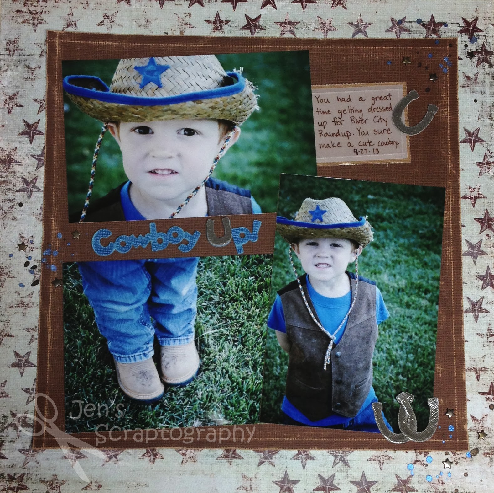
Cowboy Up! Layout

I happened to stumble upon the Simon Says Stamp Blog- Monday Challenge this week while online.  This weeks theme is 'this is where the cowboy rides away'.  I love a challenge so I decided to play along.  I knew I had some super cute photos of my youngest from River City Roundup day at school this year so I decided to use those for my layout.  Here is what I came up with.
I am so happy with how this page turned out!  After choosing my papers I worked on my photo placement.  This took me a long time!  I originally wanted them in a closer cluster but the photo of his boots just didn't look right below either of the other photos.  I finally decided to put a little space between them to add my title.  That did the trick.  I placed them all on a large square that I embossed using my score board.  I then distressed and sanded the edges to give a rustic feel to the layout.  I cut the title from the Old West Cricut cartridge five times.  I then layered and glued all five images together to get a chipboard like title.  I just love the dimension.  
I also sanded the top layer and covered the 'u' with Glossy Accents.  I love how this paper looks almost like denim.  Perfect for this layout.  A fun title for a fun page.  
To add some interest and a visual triangle on my page I got out my Glimmer Mists.  I hardly ever use them but wanted to try them on this page.  I have both a blue and brown one so they matched perfectly.  Instead of spraying them on my page I sprinkled them next to my title, journaling, and horseshoe accents.  I love the sparkle and interest they give to the page.  I will definitely be using these more on my pages.  I also added some mini star brads in these same areas.  I love how this ties the whole page together.   
I did my journaling on a piece of vellum and embossed the edges to match the embossed edges of my photo mat.   Another horseshoe covered in Glossy Accents brings attention to the journaling and ties it in with the rest of the page. 
I hope you enjoyed this layout.  I'm glad to get another page done especially since it's for my little guy.  His book isn't very full yet.  Thanks for stopping!

Supplies:
  • cardstock- Core'dinations
  • patterned paper- My Mind's Eye (29th Street Market)
  • Cricut cartridge- Old West
  • tools- Close to My Heart (Edge Distresser), sanding block, Martha Stewart (Scoring Board)
  • misc- Ranger (Glossy Accents), vellum, Tattered Angels Glimmer Mist (Denim Blue, Tattered Leather), The Paper Studio (Mini Star Brads), Zig Writer (Chocolate)
 

Monday, December 30, 2013

2013 Favorite Cards and Layouts

I thought as this year comes to an end I would share my favorite cards and layouts that I've posted this past year.  I didn't have as many to choose from as I would like (insert New Year's Resolution #1- get more scrap booking done!).  I hope you've had fun this year as I've shared with you some fun techniques and paper crafting projects.  I hope to share even more in 2014!
Get Well Card
TMNT Birthday Card
Curious George Card
Fairy Tale Wedding Card
Washi Tape Birthday Card
Fun Star Border
How to Make a Paper Rosette
Smiles are Joy Layout
First Project Life Page
What's Up? Card
Guest Designer Challenge Card
Combining Project Life with a Traditional Layout
Tummy Time Layout
Halloween Birthday Card
Stay tuned tomorrow where I'll share my favorite photos from 2013.  Thanks for stopping!

Monday, October 21, 2013

A Little Man With a Big Plan Layout

I haven't put a layout up for a little while so I figured I should get one up!  This is a layout I worked on while I was on my little vacation over the summer in Las Vegas.  When I went on my trip I only packed the necessities- photos, cardstock, patterned paper, adhesive, and a few embellishments.  That was it!!  Luckily I was scrapbooking at my best friends house so that I could borrow her tools, stamps, inks, etc.  Because of my minimal supplies I really had to use what I had in creative ways.  I'm going to be sharing more pages from that trip in the upcoming weeks.  These pages are simple yet still pack a big punch.  I hope you enjoy them. 

Here is today's page.  The page came together in a snap because all of the elements are from the same paper line.  I love the line of square photos.  It really draws your attention to them and leaves space for a title and some fun splashes of color.  This page has no journaling except for the date.  I am usually a big fan of journaling but this page required none.  
My title was made with some patterned paper and rubons from Fancy Pants Designs To the Moon collection.  I love that the lined paper made it easy for me to get my title on straight.  I am a big fan of using lines in patterned paper to add titles/journaling spots for this very reason.   
In order to draw more attention to the title and add some fun I used these chipboard pieces also found in this collection.  The little aliens are so fun and who doesn't love colorful stars?!  I stamped a movement trail to make it look like these guys are really moving. 
To add a little interest to my line of photos I put the middle one on pop dots.  This helps that photo stand out a little from the others and also is a great way to add some dimension to your page.  It's also a great way to adhere photos that might not fit perfectly side by side on your page.  I hate having a little gap when adhering photos in a row and this is a great way to make sure that doesn't happen.  
To add some fun color at the bottom of my page I grabbed four different papers from this collection and cut rectangles of the same size rounding the top corners.  Because they are all from the same collection they work together perfectly!  I purposely used two papers with space ships on them so that I would have three space ships on my page to help lead your eye around the page.  
The two spaceships at the bottom of the page needed a little something special so I got out my sparkle pen and colored in a few areas on each one.  This adds some interest and is a fun and easy way to alter your patterned paper.  
I hope you enjoyed this simple layout and try one of these ideas on your next page.  Thanks for stopping!

Supplies:
  • cardstock- Bazzil Basics Paper
  • patterned paper- Fancy Pants Designs (To the Moon)
  • rubons- Fancy Pants Designs (To the Moon)
  • chipboard- Fancy Pants Designs (To the Moon)
  • tools- Creative Memories (corner rounder)
  • stamp- TPC Studio (Transportation)
  • ink- Memories Dye Ink (black)
  • pens- American Crafts (Project Life 03 black), Gelly Roll (Stardust)
  • misc- foam squares